

There is a tradition at Scotus Central Catholic (my alma mater) that involves creating a poster for the annual musical. Upon being signed by the cast and crew, the poster is put on display in one of the hallways of the school. In 2014, I was assigned the task of making that year's poster.
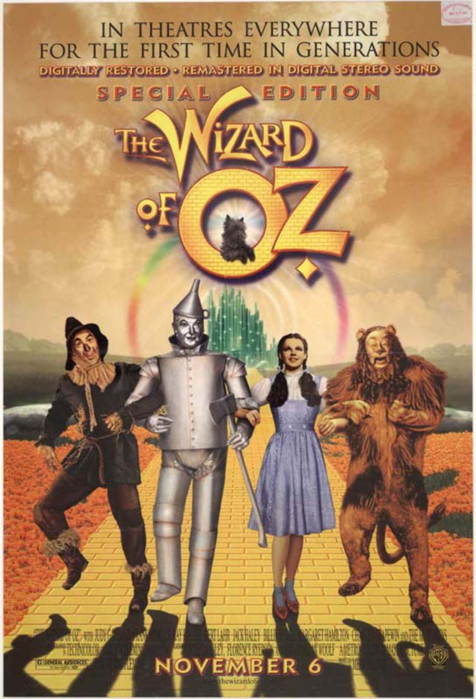
The theatrical poster I used for inspiration.
Modeled off of a vintage Wizard of Oz movie poster (seen above), it depicts the main characters upon a yellow brick road, while villains and heroes alike surround them in the bleak sky (representing the dull world that Dorothy resided in before venturing to the colorful Land of Oz). They are positioned above information about the play, featured in a typeface reminiscent of theatrical posters.
The yellow brick road was created using a simple yellow brick texture in collaboration with perspective tools in Adobe Photoshop. Once completed, the road was placed on an image of a meadow. The emerald city was taken from an image of a theatrical backdrop used for a production of the "Wizard of Oz". All the images of the actors were taken from Scotus Central Catholic's photography of the production. Avid Oz fans will notice the nod to the first edition of the novel in the typeface used for the date.
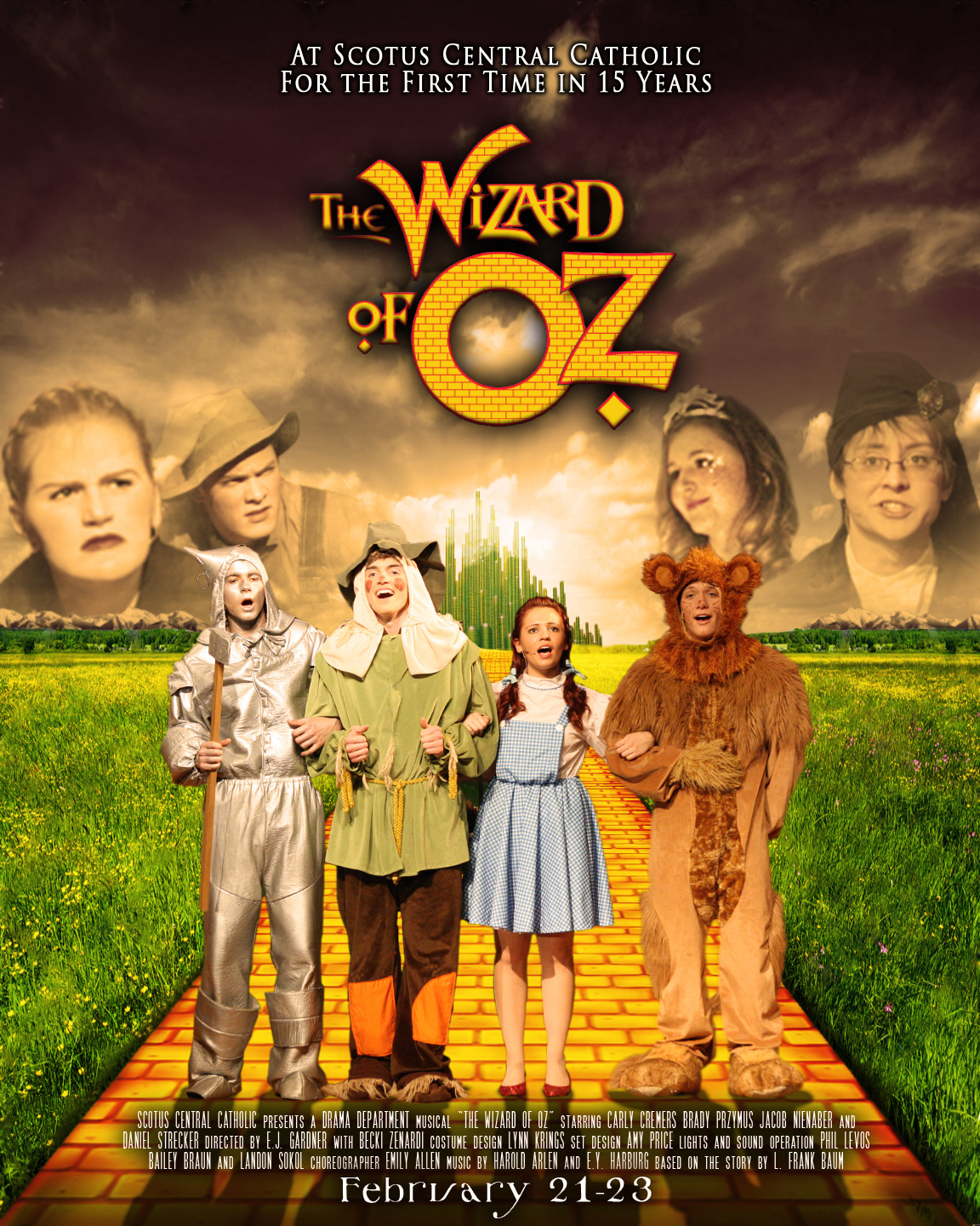
The improved poster created in 2016.
The redesign (seen above) features shadows where the grass meets the yellow brick road, creating a more naturalistic scene. In order to make the credits and date text pop more, I changed the color of the text to white, applied a shadow to it, and placed a black-to-transparent gradient under it.
I also removed the extra information under the credits. This was done for three reasons. Firstly, these tiny graphics did not lend to an easy color change from white to black. Secondly, they were, in some cases, impractical. This is true especially in the case of the "G Rating" (this was a high school play production, not a movie) and the drama masks (these were put in as a filler). Thirdly, it took away the busyness of the bottom portion of the poster, making it much more aesthetically pleasing.
Minor improvements can be seen in the return of the Lion's missing ear, the improved trimming of the characters, the darkening of the wicked witch in the left portion of the sky, the addition of clouds in front of the Emerald City, and the introduction of mountains in the background.