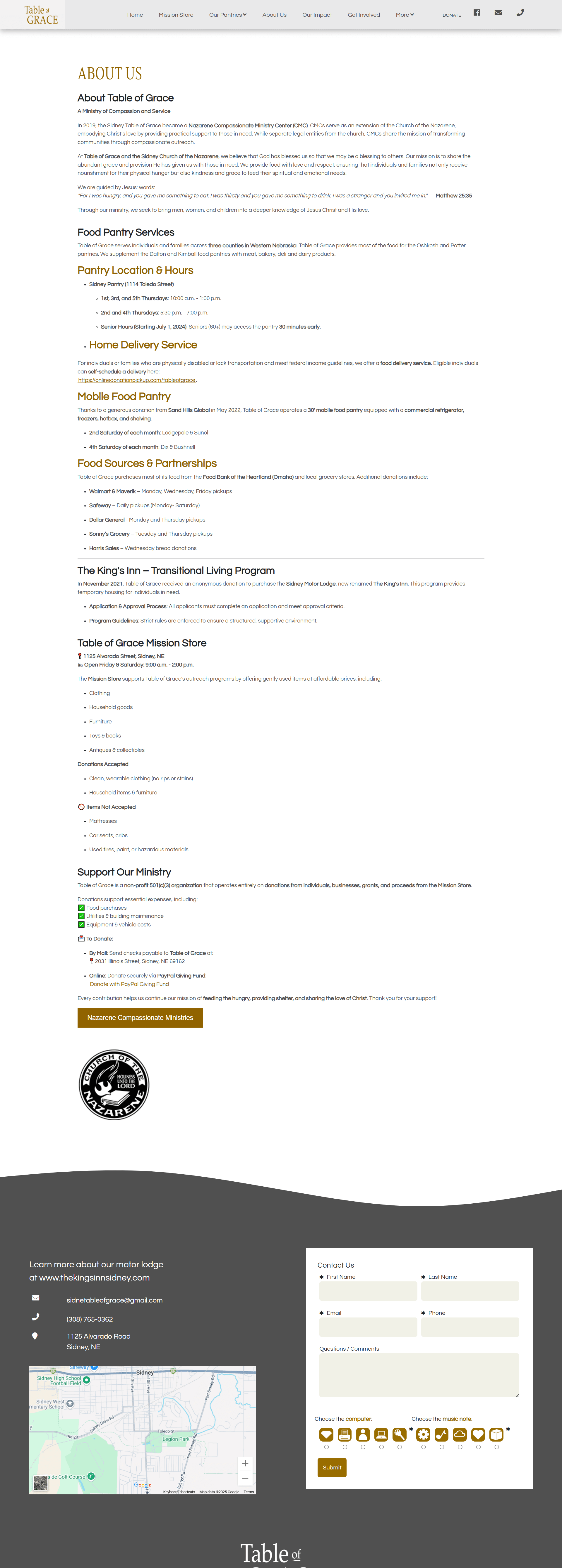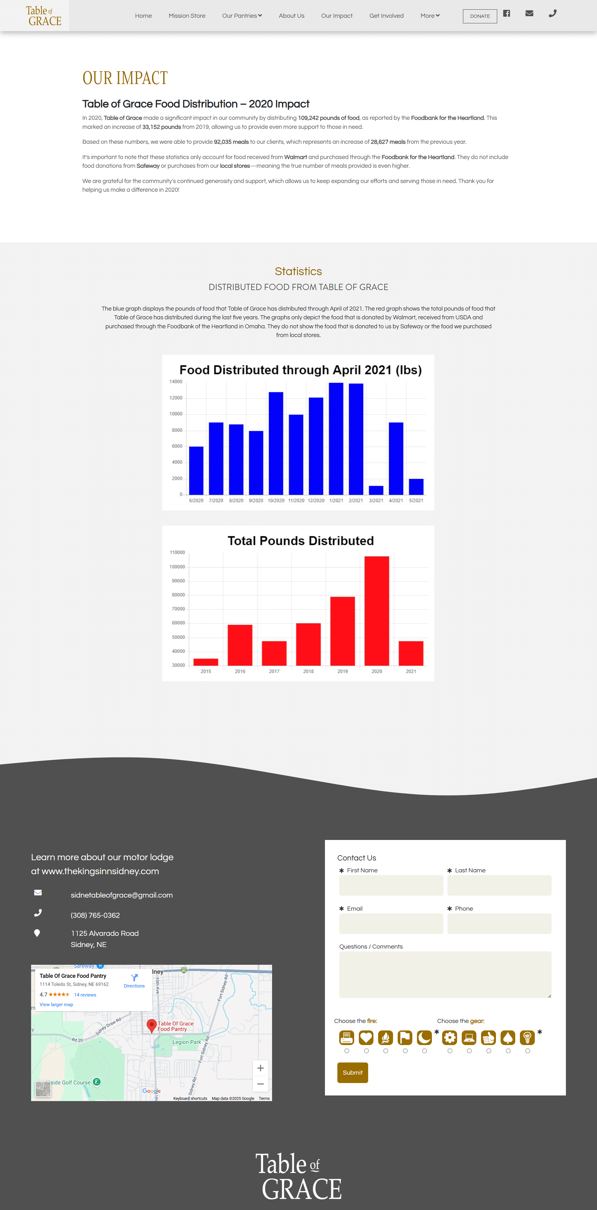


Sidney Table of Grace is a non-profit based in western Nebraska with a huge heart and a wide reach. While working at Sandhills Global, I designed and built their website from the ground up—this time answering directly to upper management instead of working through a rep. The site needed to be calm, clear, and deeply usable for a wide range of community members and volunteers.
Navigation & Scroll Logic
One of the main design goals was to drive visitors toward the Pantries page. I kept the hamburger menu pinned in the top-right corner at all times, even as the logo fades out on scroll. This interaction, powered by GSAP, keeps the user focused while maintaining full access to navigation. The design is mobile-first, reflecting the real-world ways people engage with this nonprofit—often through a phone, often in a moment of need.
One of the main design goals was to drive visitors toward the Pantries page. I kept the hamburger menu pinned in the top-right corner at all times, even as the logo fades out on scroll. This interaction, powered by GSAP, keeps the user focused while maintaining full access to navigation. The design is mobile-first, reflecting the real-world ways people engage with this nonprofit—often through a phone, often in a moment of need.
Typography, Tone, and Visual Language
This was a rare chance to bring in something personal. In one of the mission-focused sections, I included a quote from Jesus, in which I used the Ronald Knox Bible, a version I love for its literary quality. Knox said he didn’t just want to translate the Bible—he wanted it to read as though it had been originally written by an Englishman. As someone who cares deeply about language, it was rewarding to thread that into the tone and story.
This was a rare chance to bring in something personal. In one of the mission-focused sections, I included a quote from Jesus, in which I used the Ronald Knox Bible, a version I love for its literary quality. Knox said he didn’t just want to translate the Bible—he wanted it to read as though it had been originally written by an Englishman. As someone who cares deeply about language, it was rewarding to thread that into the tone and story.
Knox said he didn’t just want to translate the Bible—he wanted it to read as though it had been originally written by an Englishman
Content & Layout Decisions
The layout is soft but purposeful. I designed clear blocks of content that walk users through their programs—volunteering, donating, partnering—using plenty of white space and a neutral palette. Photos were chosen to feel genuine, not polished. The whole structure supports the mission, helping visitors get involved or find help without having to dig.
The layout is soft but purposeful. I designed clear blocks of content that walk users through their programs—volunteering, donating, partnering—using plenty of white space and a neutral palette. Photos were chosen to feel genuine, not polished. The whole structure supports the mission, helping visitors get involved or find help without having to dig.
Development Workflow
As with all Sandhills WordPress sites, this was a custom theme built entirely from scratch. I handled all front-end development—HTML, CSS, PHP, and JavaScript—and leaned on Chrome DevTools constantly to test responsiveness, refine animations, and smooth out scroll behavior.
As with all Sandhills WordPress sites, this was a custom theme built entirely from scratch. I handled all front-end development—HTML, CSS, PHP, and JavaScript—and leaned on Chrome DevTools constantly to test responsiveness, refine animations, and smooth out scroll behavior.
This was a meaningful build, not just because of the cause it supports, but because it brought together design, development, and storytelling into a single experience that still holds up today.

