

Project Overview
While working with Sandhills Global, I was tasked with designing and developing a new website for Maverick Environmental Equipment, an Ohio-based company that sells industrial equipment in the aggregate processing, waste recycling, forestry, and biomass sectors.
The client wanted a website that felt “big, bold, and beautiful”—a significant departure from the basic, utilitarian layout of their previous site. My role was to lead the project from early planning through to design and development, ensuring that the result would reflect the strength of their brand while staying accessible, responsive, and modern.
Discovery & Planning
The project began with a series of detailed meetings between myself, the client representative (Lisa), and the Sandhills Global sales lead (Mitch). These conversations helped us define not just what the site should look like, but how it should work and feel. The client emphasized that they wanted something visually striking, with subtle animation, modern aesthetics, and a layout that highlighted their diverse brand portfolio and key equipment categories.
From those discussions, it became clear that the new site needed to do more than organize content—it had to make a strong first impression and encourage exploration.
Design Direction
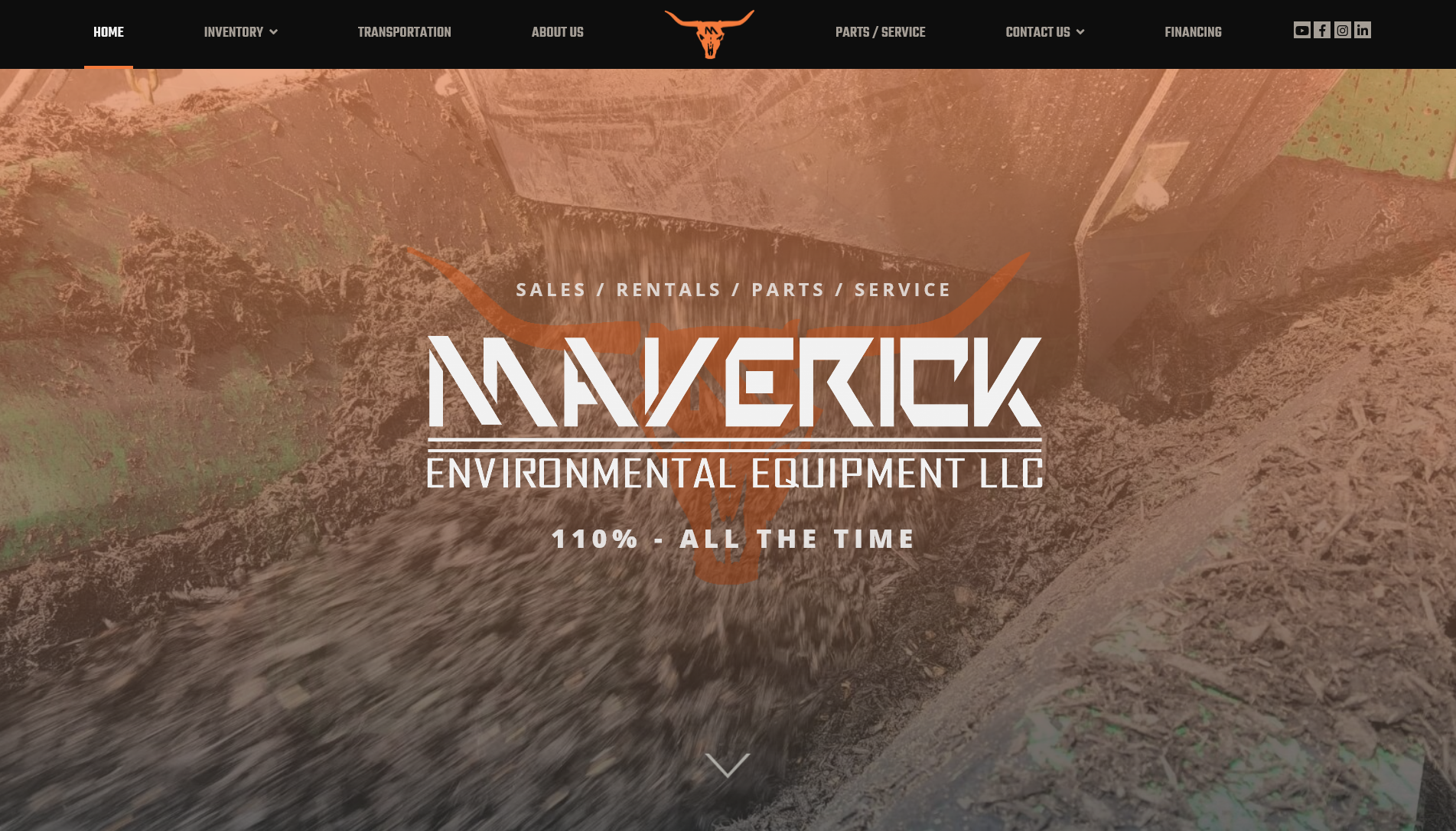
To shape the visual direction, I shaped everything around big, bold pictures. I knew I wanted that to be the focus from the start. Nothing catches the eye like a solid photo contrasted against a muted but appealing gradient.
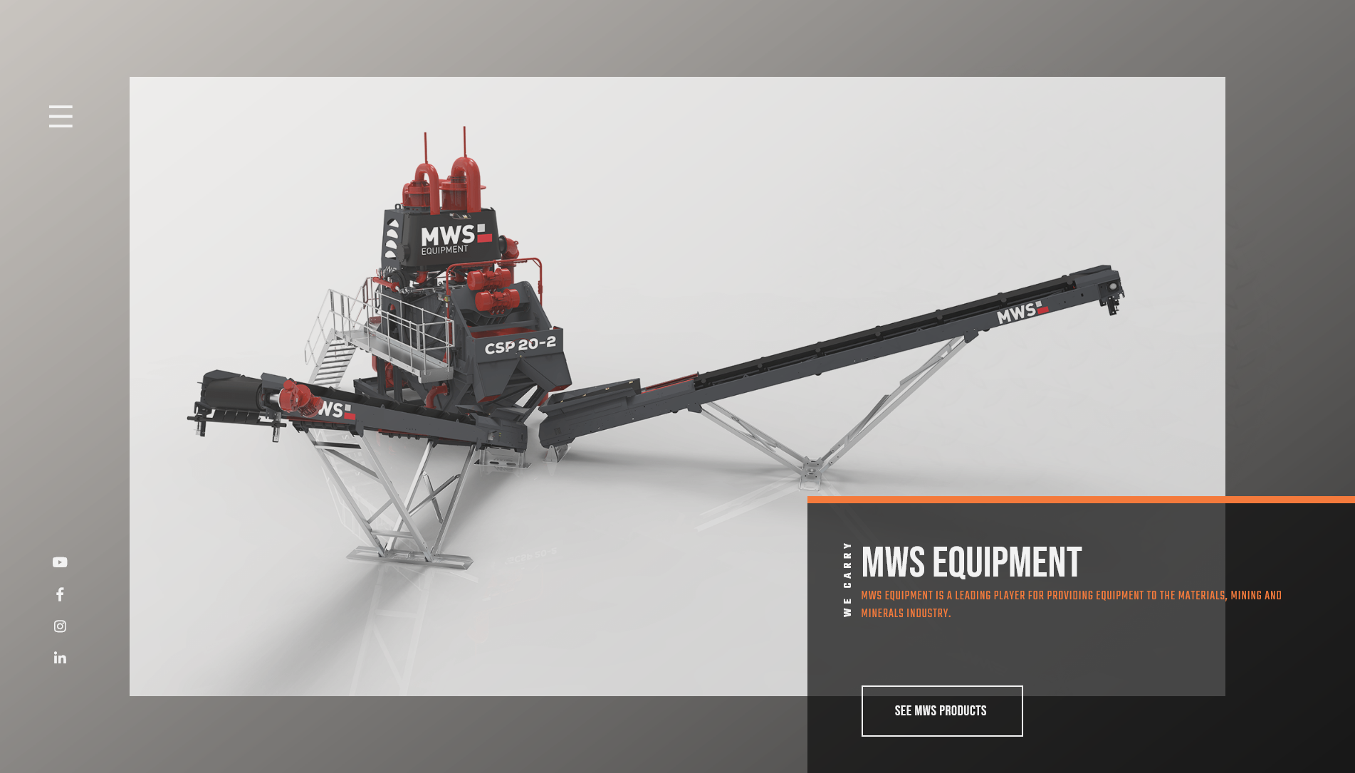
I knew these pictures would have to be the focus as the user scrolls through the varied brands that Maverick showcased. After the photo caught the users eye, a box would fade into view, drawing the eye to the links that the customer is looking for - equipment categories.
Behind this, I introduced a textured background inspired by diamond plate steel—a subtle reference to the rugged industry they work in. Layered over this texture were gradients that added depth and created a smoother reading experience. Their primary brand color, a bold orange, was used throughout the design in an assortment of hues and brilliances to highlight calls to action, headings, and important UI components. Set against a dark background, this created strong contrast and reinforced brand recognition created by the bold images.
Typography was deliberately oversized and clean, creating a hierarchy that made scanning content easy while still feeling bold and intentional.
Interactive Experience
To support the visual structure and maintain engagement, I added subtle motion throughout the site. Images fade in gently as users scroll. Text blocks load with direction and timing that complements the flow of the page. Buttons respond with movement and visual feedback to signal interaction.
These touches were designed to support usability, not distract from it. Everything was kept lightweight to ensure fast load times and smooth performance across devices—especially on mobile, where visual consistency and responsiveness were critical.
Before & After
The original Maverick website was simple and functional, but visually flat. Important content was difficult to navigate, and the visual design didn’t reflect the scale or capability of the company.
In the new site, the layout emphasizes brand clarity and user direction. Equipment categories and featured brands are easy to access, CTAs are clearly marked, and the overall design encourages users to explore rather than click away.
Coding & Implementation
Development followed Sandhills Global’s custom approach, where each WordPress site is built from scratch as a fully custom theme using HTML, CSS, and PHP. There’s no reliance on page builders or off-the-shelf templates—every layout and component is hand-coded for performance and control.
Because of that, I had to be strategic in how I structured the theme. A key part of the process was identifying what content the client would need to update themselves and what could remain static. This meant asking detailed questions during the planning phase to separate editable content—like featured brands, equipment categories, and text blocks—from background textures, layout structure, and animated elements that were better hardcoded for consistency.
For animation, I used the GreenSock Animation Platform (GSAP) to create lightweight, smooth transitions across the site. This included image fades, scroll-triggered text reveals, and subtle button animations—all optimized to load quickly and run cleanly across devices. GSAP allowed for more precise control than CSS alone and helped achieve the polished, modern movement the client wanted without compromising performance.
The result was a flexible, responsive custom theme that combined performance, client usability, and the visual fidelity needed to meet Maverick’s “bold and beautiful” brief.
Outcome
The final website aligns with the client’s vision of being bold, modern, and engaging. The experience is responsive, visually distinctive, and structured to support both browsing and conversion.
The design and layout give Maverick Environmental Equipment a stronger presence online—one that communicates their values, highlights their partners, and creates a more lasting impression on their visitors.