


While at Sandhills, I had the privilege to design an ad for their Machinery Trader Auction Results magazine. I designed three ads for this publication, with ultimately one of them making the cut. This was the Enterprise Capital full-paged ad I designed, and I believe it to be the best work produced in my professional career thus far.
A bit of a background: Enterprise Capital is a loan company, and Machinery Trader Auction Results is a bi-annual publication which details the results of Sandhills’ many hosted auctions for heavy equipment. They needed an ad that let people know that they are there to help pay for any new equipment that readers obtained in the auctions they participated in.

Fig. A: The color scheme I received.

Fig. B: The logo I received.

Fig. C: The logo I created in Illustrator based off the original.
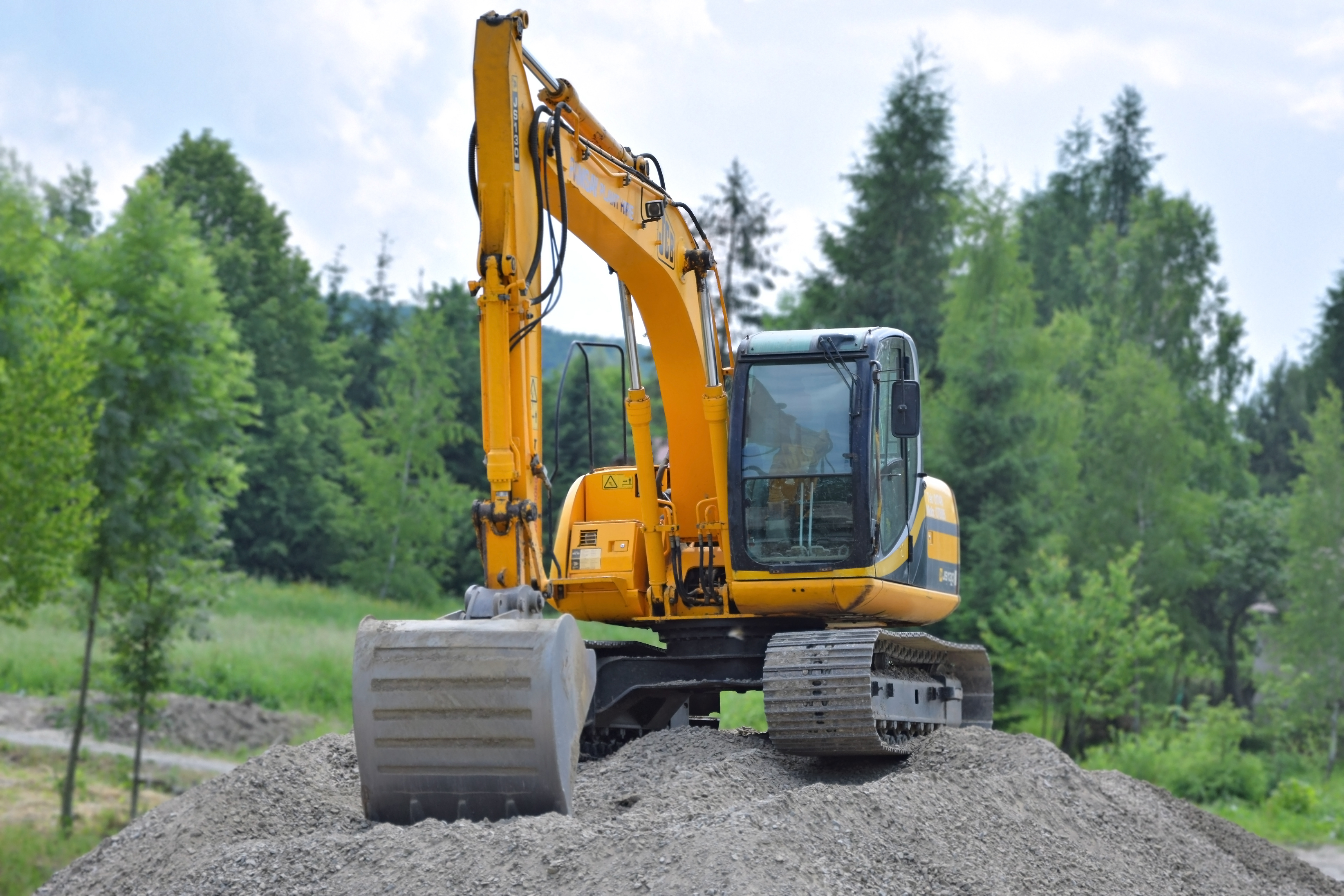
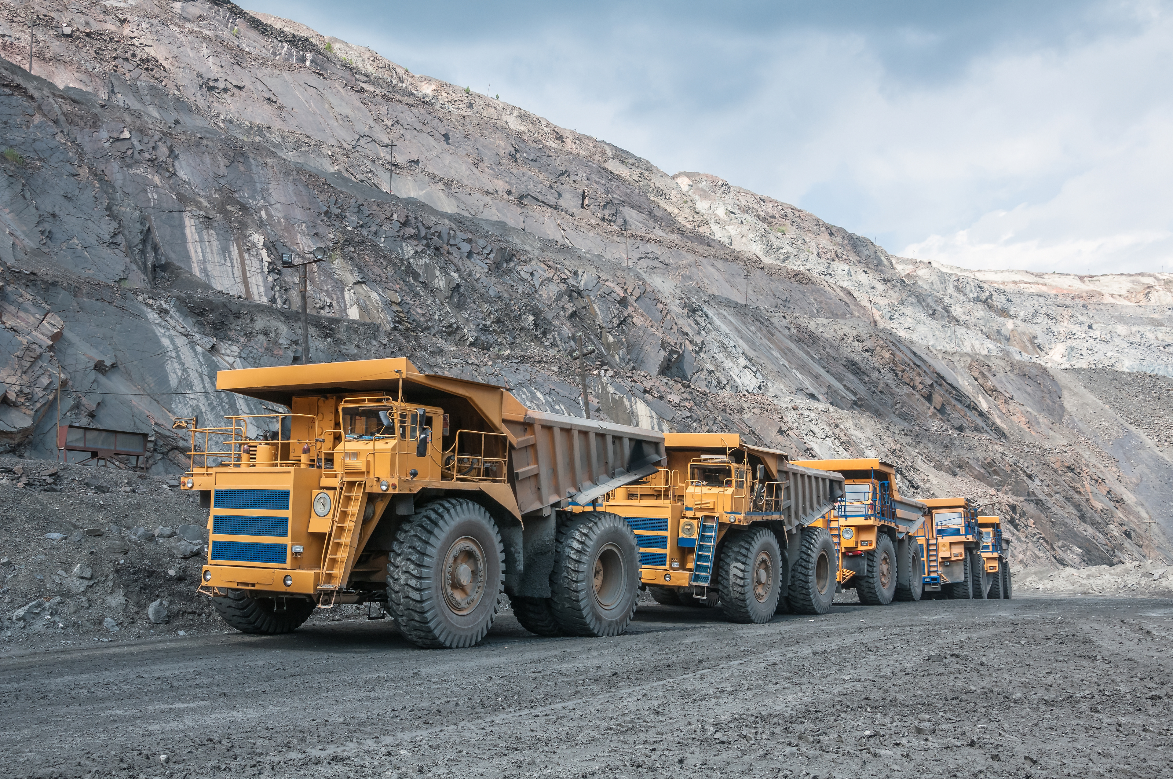
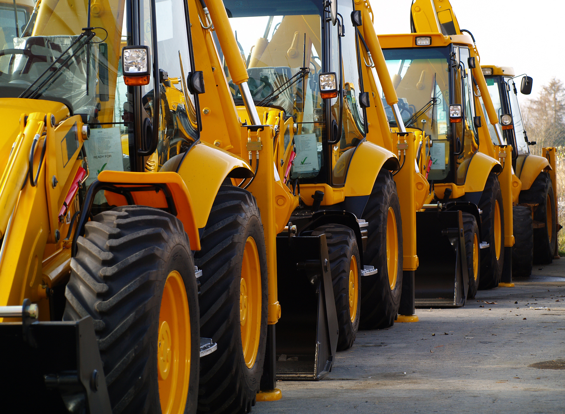

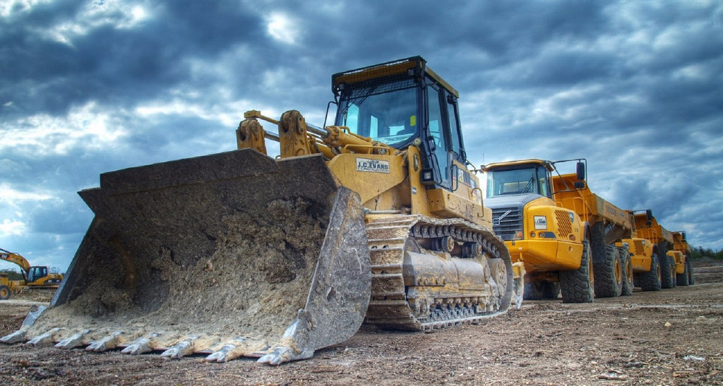
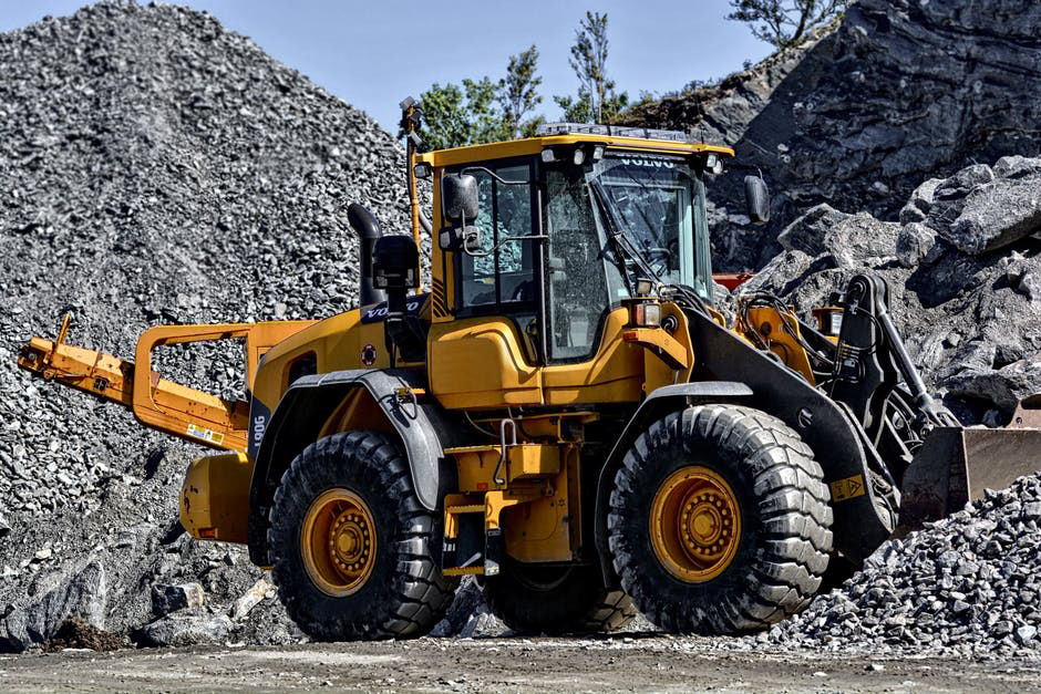
Fig. D: The photos I received.


Fig. E: The designs that did not make the cut.
Enterprise Capital provided me with most of the resources I would need. From the get-go, I received a color scheme (fig. A), their logo (fig. B), as well as 6 images of heavy equipment (fig. D). The logo was actually redone by myself in Illustrator (fig. C), as the one provided initially was rather blurry. My task was to take all these resources to produce something extraordinary. I made three different concepts for the company. The two concepts that did not make the cut can be seen in fig. E.
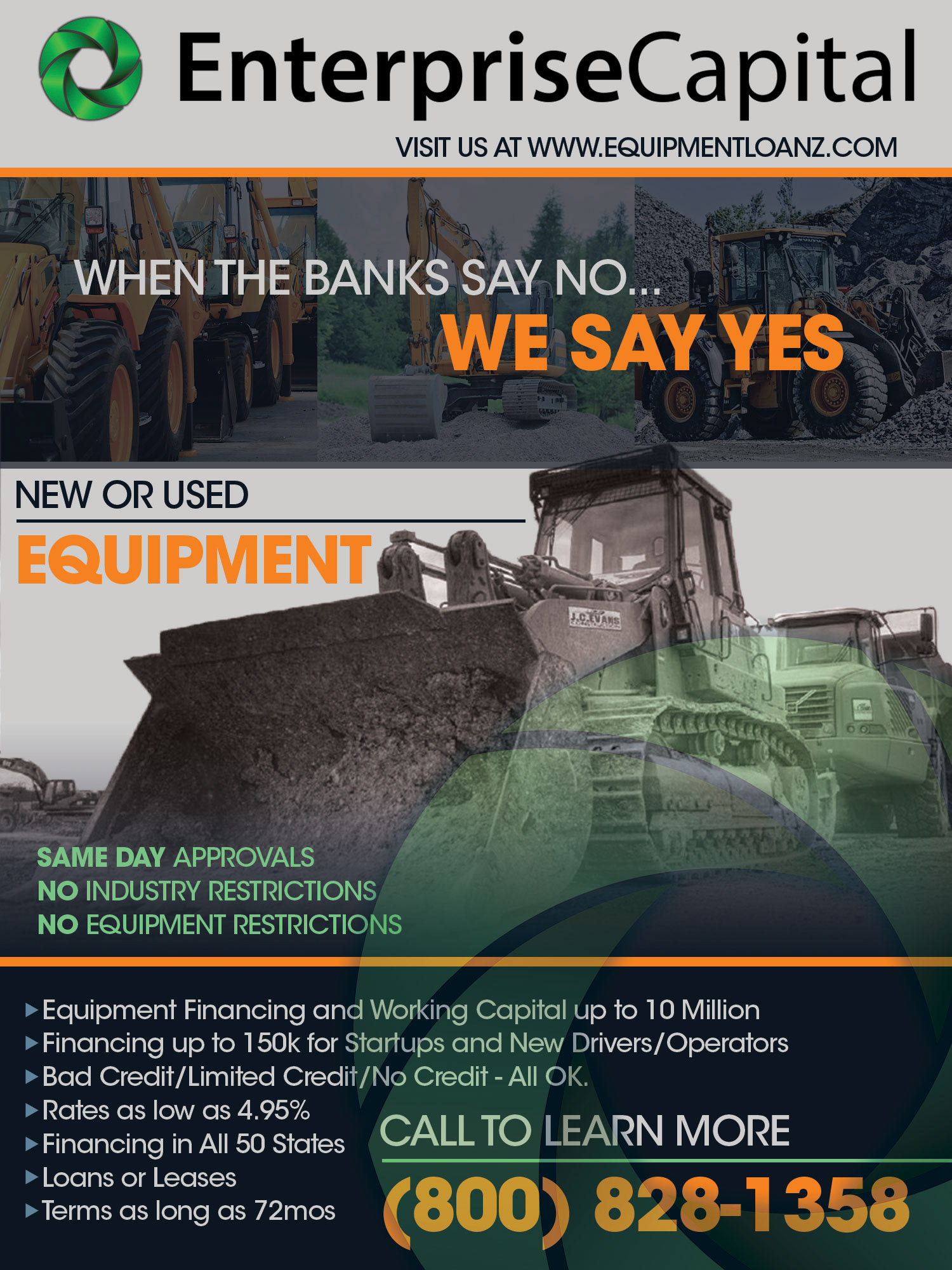
Fig. F: The final design that made it into the magazine.
For the design that did make it (fig. F), I took inspiration from the cover of a Sandhills Publishing employee magazine I had laying around. This magazine featured Sandhills’ logo running across the top, a black and white image of tractors, with a semi-visible grey gear watermarked across the image of the tractors. I took these elements and applied them to the EnterpriseCapital on the top as well as the portion of the ad with the bulldozer. To make the “New and Used Equipment” more readable, I cut out the background of the bulldozer, replacing it with a gradient based off the grey found on their color scheme. This had the advantage of making the bull dozer pop out more. The enlarged wheel icon was placed on top of the image as a watermark, with the transparency set to 30%. I completed the ad by adding three images on top of this with a purple overlay, and information below with set in orange against a purple background.