


This was a full custom website build for Corner View Farm Equipment, completed in 2023 while I was working as a UI/UX designer at Sandhills Global. I handled both the design and front-end development, working from concept to code to deliver a fast, responsive site tailored to the client’s audience — farmers looking for reliable, pre-owned forage harvesters.
Homepage Layout & Brand Messaging
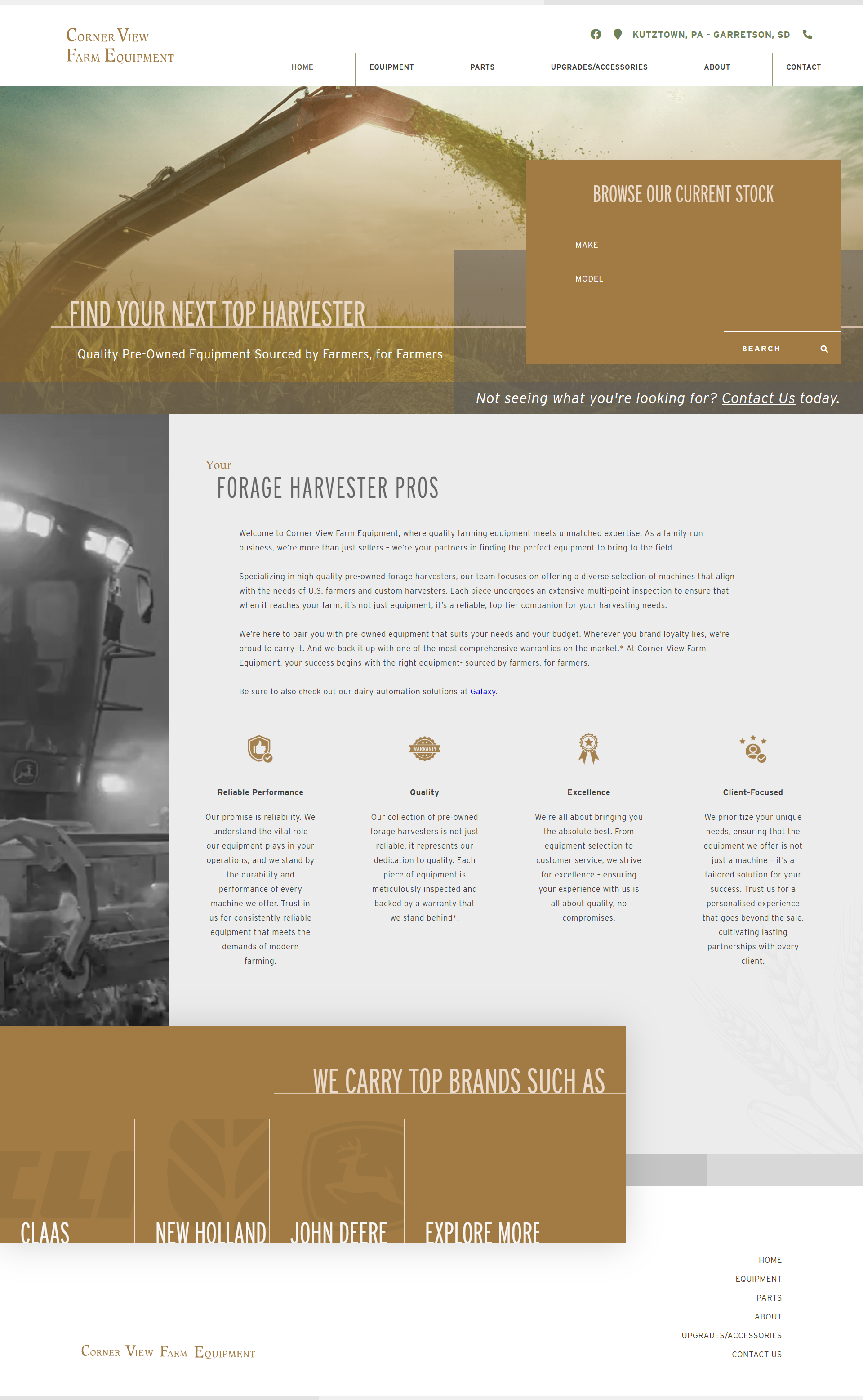
The homepage leads with a strong identity statement — “Sourced by Farmers, for Farmers” — supported by a clean hero layout. One of the more interesting challenges came late in the process, when the client asked for a search bar on the homepage. It wasn’t part of the original visual hierarchy, so I reworked the hero to make the search bar feel native to the layout — anchored just beneath the brand headline, with clear prompts to search by make or model. The result fits naturally into the design while improving usability across devices.
The homepage leads with a strong identity statement — “Sourced by Farmers, for Farmers” — supported by a clean hero layout. One of the more interesting challenges came late in the process, when the client asked for a search bar on the homepage. It wasn’t part of the original visual hierarchy, so I reworked the hero to make the search bar feel native to the layout — anchored just beneath the brand headline, with clear prompts to search by make or model. The result fits naturally into the design while improving usability across devices.
Design Language & Grid System
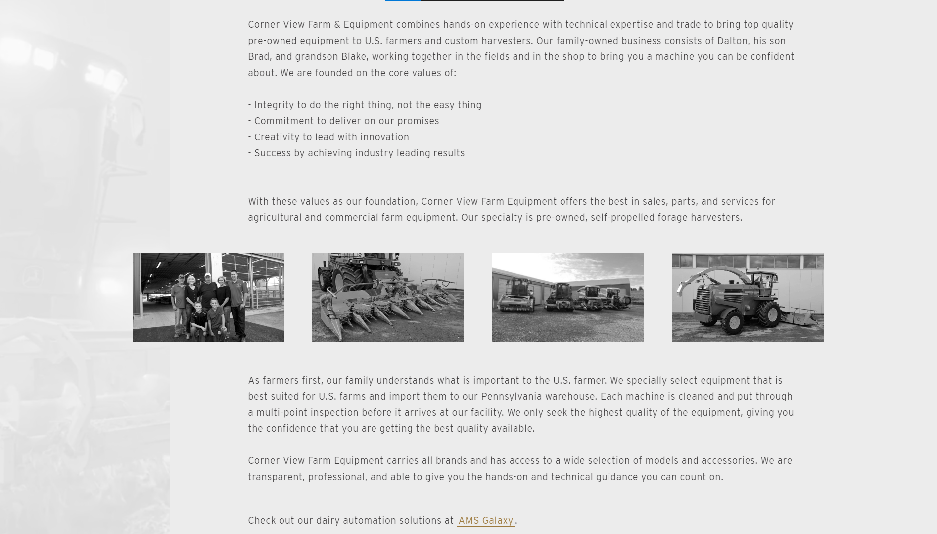
The site is structured around a minimal, slightly offset grid that creates visual movement while maintaining alignment. This quiet asymmetry gives the layout rhythm and helps key sections like the “Forage Harvester Pros” message and brand affiliations stand out. The aesthetic blends rural warmth — soft colors, open spacing, grounded typography — with a modern, crisp feel.
The site is structured around a minimal, slightly offset grid that creates visual movement while maintaining alignment. This quiet asymmetry gives the layout rhythm and helps key sections like the “Forage Harvester Pros” message and brand affiliations stand out. The aesthetic blends rural warmth — soft colors, open spacing, grounded typography — with a modern, crisp feel.
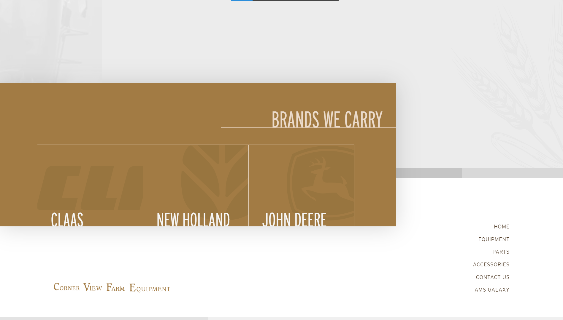
The bottom of the page - note the brand buttons in grid layout featuring text and images offset from center, left, and right, creating a sense of movement and dynamism enticing the user to click. Also note the contrast of color doing the same.
Inventory Presentation & Responsiveness
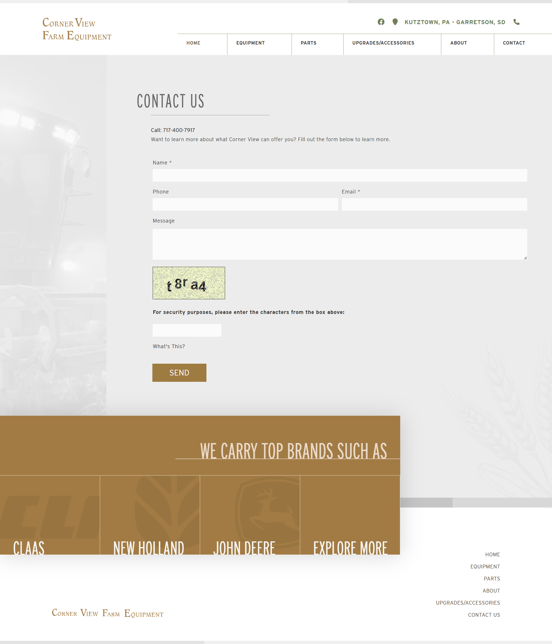
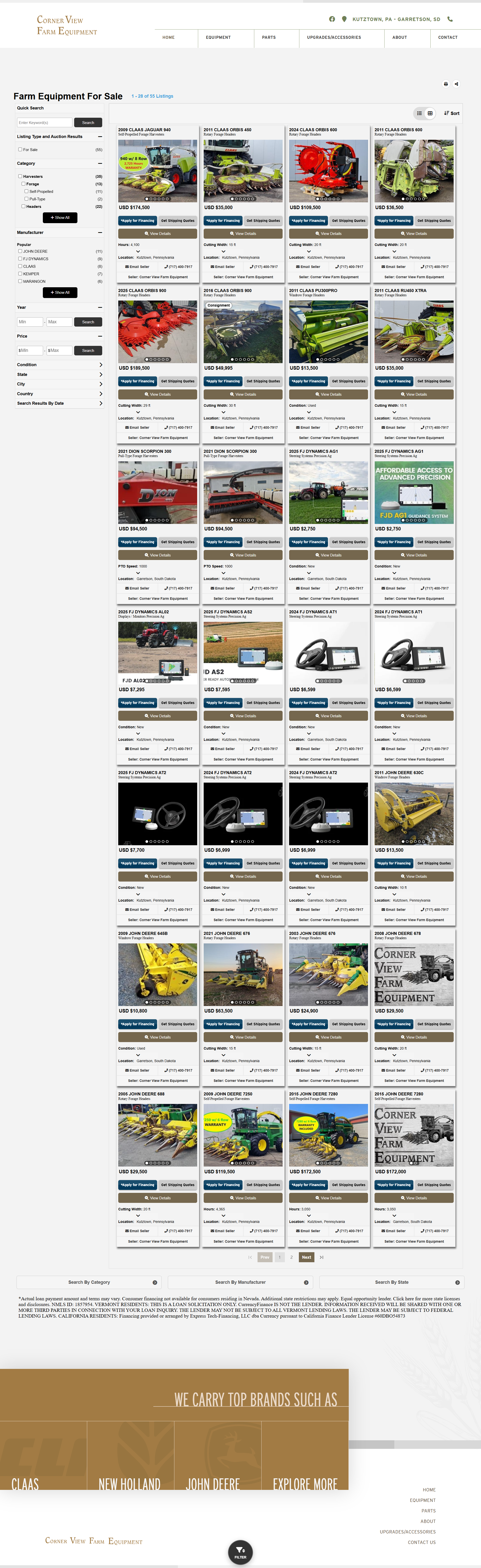
Inventory is shown in a consistent card layout with filters for category, brand, and price. The site is fully responsive, scaling cleanly from desktop to mobile without losing structure or clarity. Special care went into keeping performance high — critical for users in rural areas with limited bandwidth.
Inventory is shown in a consistent card layout with filters for category, brand, and price. The site is fully responsive, scaling cleanly from desktop to mobile without losing structure or clarity. Special care went into keeping performance high — critical for users in rural areas with limited bandwidth.
Development Workflow
This was a hand-coded build using HTML, CSS, and JavaScript. No CMS, no frameworks — just clean, modular code. I relied on Chrome DevTools throughout to refine layout, spacing, and interactivity. The result is a lightweight, high-performing static site that just works.
This was a hand-coded build using HTML, CSS, and JavaScript. No CMS, no frameworks — just clean, modular code. I relied on Chrome DevTools throughout to refine layout, spacing, and interactivity. The result is a lightweight, high-performing static site that just works.