


Project Overview
This project was completed as part of my work with Sandhills Global, where I led the strategic redesign of the Bass Truck Center website. The client, a regional commercial truck dealership, had an outdated and difficult-to-navigate site. Visitors struggled to find key information, and calls to action were often inconsistent or broken.
This project was completed as part of my work with Sandhills Global, where I led the strategic redesign of the Bass Truck Center website. The client, a regional commercial truck dealership, had an outdated and difficult-to-navigate site. Visitors struggled to find key information, and calls to action were often inconsistent or broken.
Ross served as the UX designer, and my own background in UX helped me collaborate with him more effectively—understanding his decisions and ensuring they aligned with the larger strategy. I took ownership of the site’s overall direction, leading the SEO audit, developing the sitemap, and guiding the structure based on user behavior, keyword research, and business needs. The goal was to turn the site into a tool that actively supported conversion, whether that meant browsing inventory, booking service, or reaching out to sales.
Role and Scope
I began with a comprehensive SEO and performance audit using tools like Google Analytics, SEMrush, and Google PageSpeed Insights. From that data, I mapped out core user journeys for audiences such as truck buyers, returning service clients, and parts shoppers. These journeys shaped the information architecture and directly influenced the sitemap I developed, ensuring the site aligned with both how users think and how they search.
I began with a comprehensive SEO and performance audit using tools like Google Analytics, SEMrush, and Google PageSpeed Insights. From that data, I mapped out core user journeys for audiences such as truck buyers, returning service clients, and parts shoppers. These journeys shaped the information architecture and directly influenced the sitemap I developed, ensuring the site aligned with both how users think and how they search.
While Ross focused on interface design, I led the strategic structure behind it. I collaborated with copywriters, providing detailed research and direction based on high-value keywords and competitor analysis. The new content was written by them, but rooted entirely in the framework I provided. I also worked closely with the sales representative and the client throughout the process, making sure everything stayed aligned and nothing fell through the cracks.
Although this was a collaborative project, I was the one coordinating moving parts, ensuring deadlines were met, and keeping the strategy consistent from planning to execution.
Challenges and Opportunities
The original site suffered from a number of usability and structural issues. Navigation lacked clarity, essential information was hard to find, and several calls to action either led nowhere or were too vague to be helpful. For example, a prominent “View Service Specials” button didn’t link to any relevant content.
The original site suffered from a number of usability and structural issues. Navigation lacked clarity, essential information was hard to find, and several calls to action either led nowhere or were too vague to be helpful. For example, a prominent “View Service Specials” button didn’t link to any relevant content.
It was clear early on that we needed to go beyond surface-level updates. The site’s architecture, content strategy, and overall flow weren’t aligned with real user behavior or expectations, and that disconnect was holding the business back online.
Strategy and Execution
The redesign process began with identifying key performance issues and behavior drop-offs. I used that data to propose a completely restructured sitemap focused on user intent. High-priority areas like inventory, service, and financing were surfaced and better integrated into the site’s layout.
The redesign process began with identifying key performance issues and behavior drop-offs. I used that data to propose a completely restructured sitemap focused on user intent. High-priority areas like inventory, service, and financing were surfaced and better integrated into the site’s layout.
I rewrote and repositioned calls to action to be more direct and strategically placed, improving both usability and engagement. I also provided copywriters with the insights they needed to craft effective, optimized content—ensuring each page reflected not just SEO goals but user clarity as well.
Throughout the project, I kept communication flowing between the team and the client. I monitored progress, followed up on open items, and made sure the details aligned with the broader strategy we’d set out from the start.
Before and After
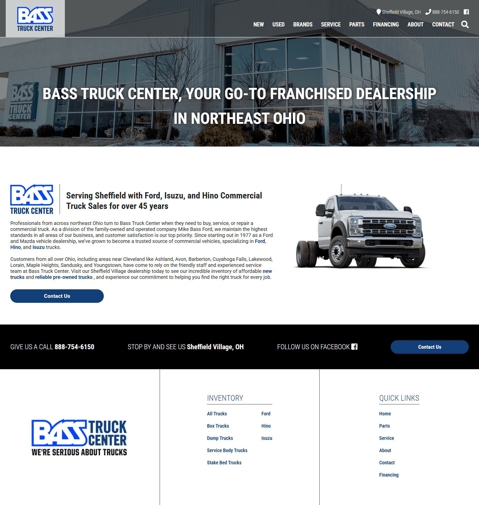
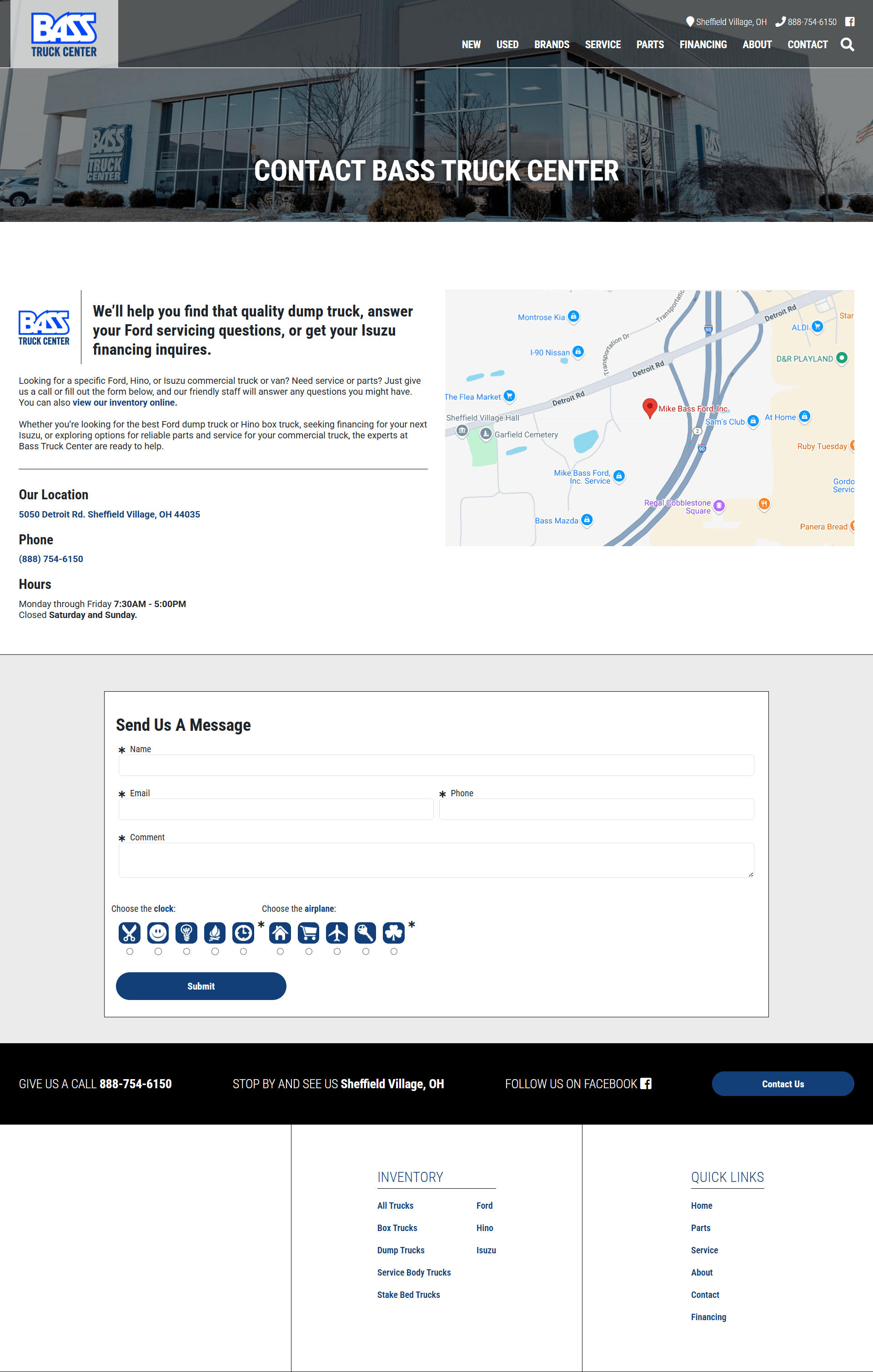
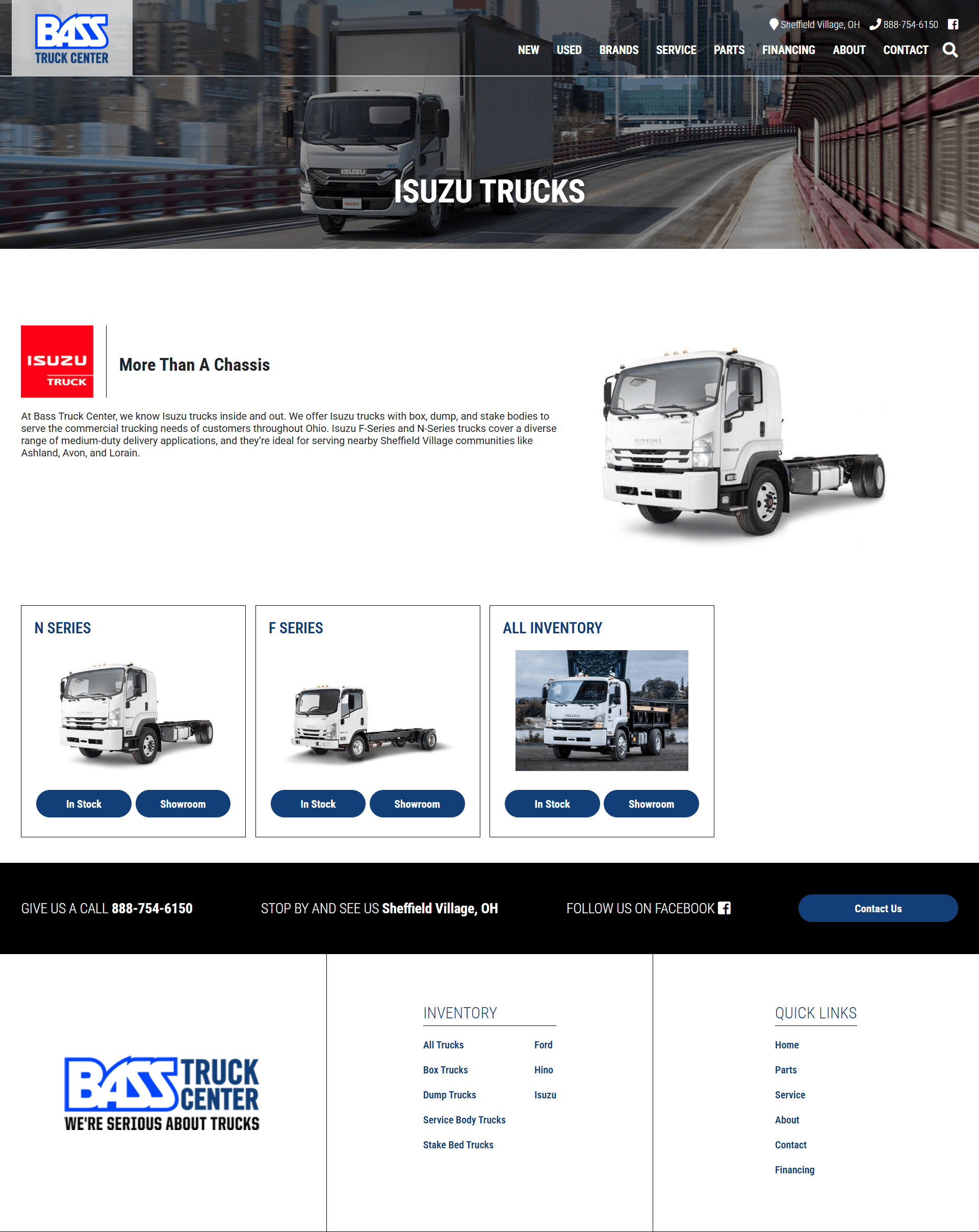
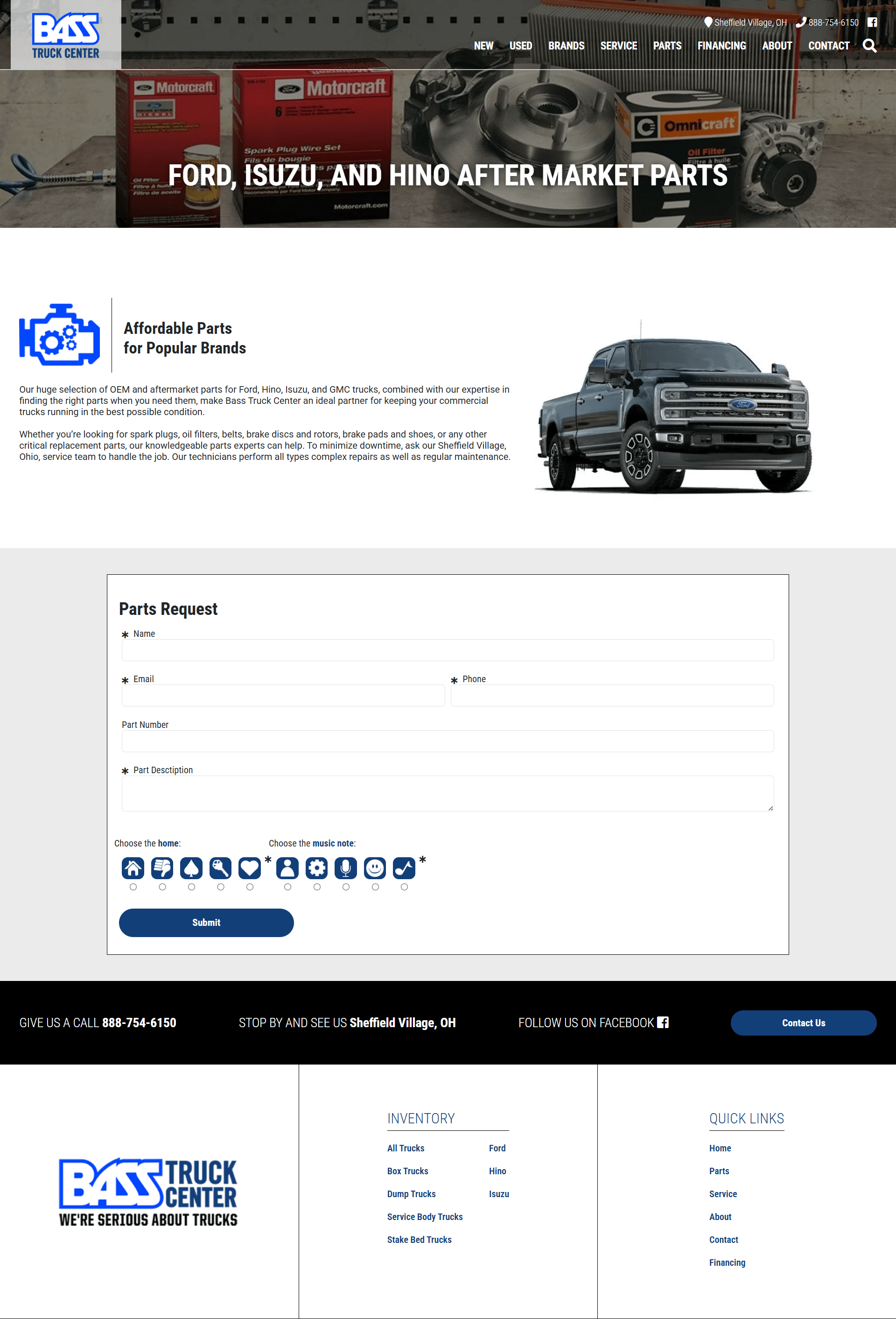
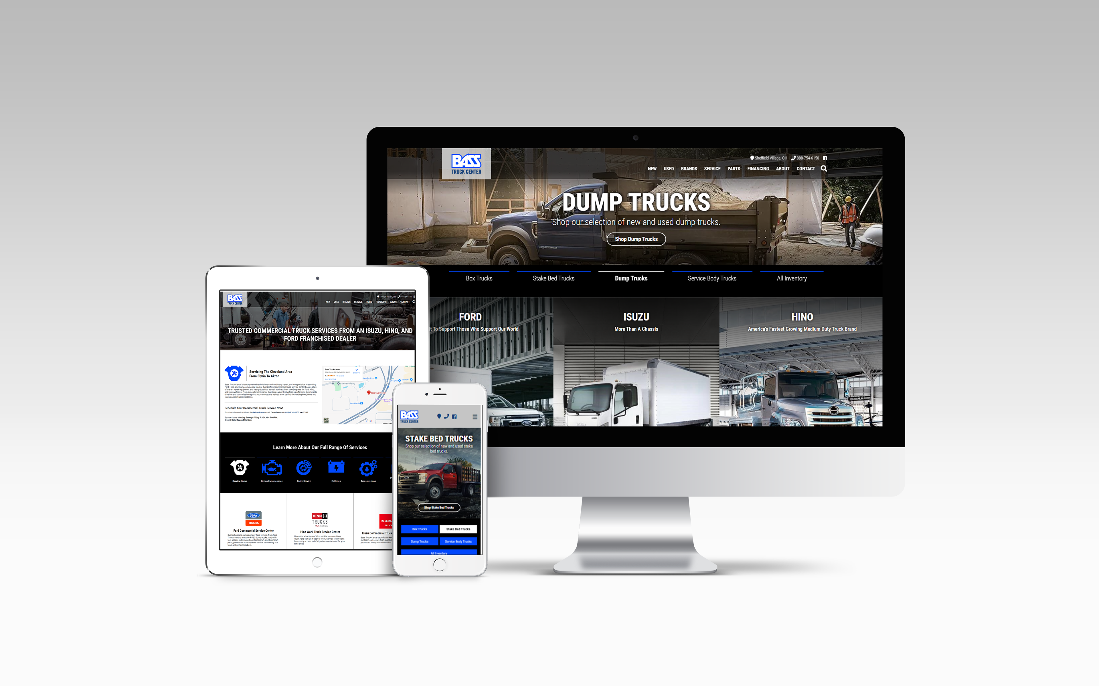
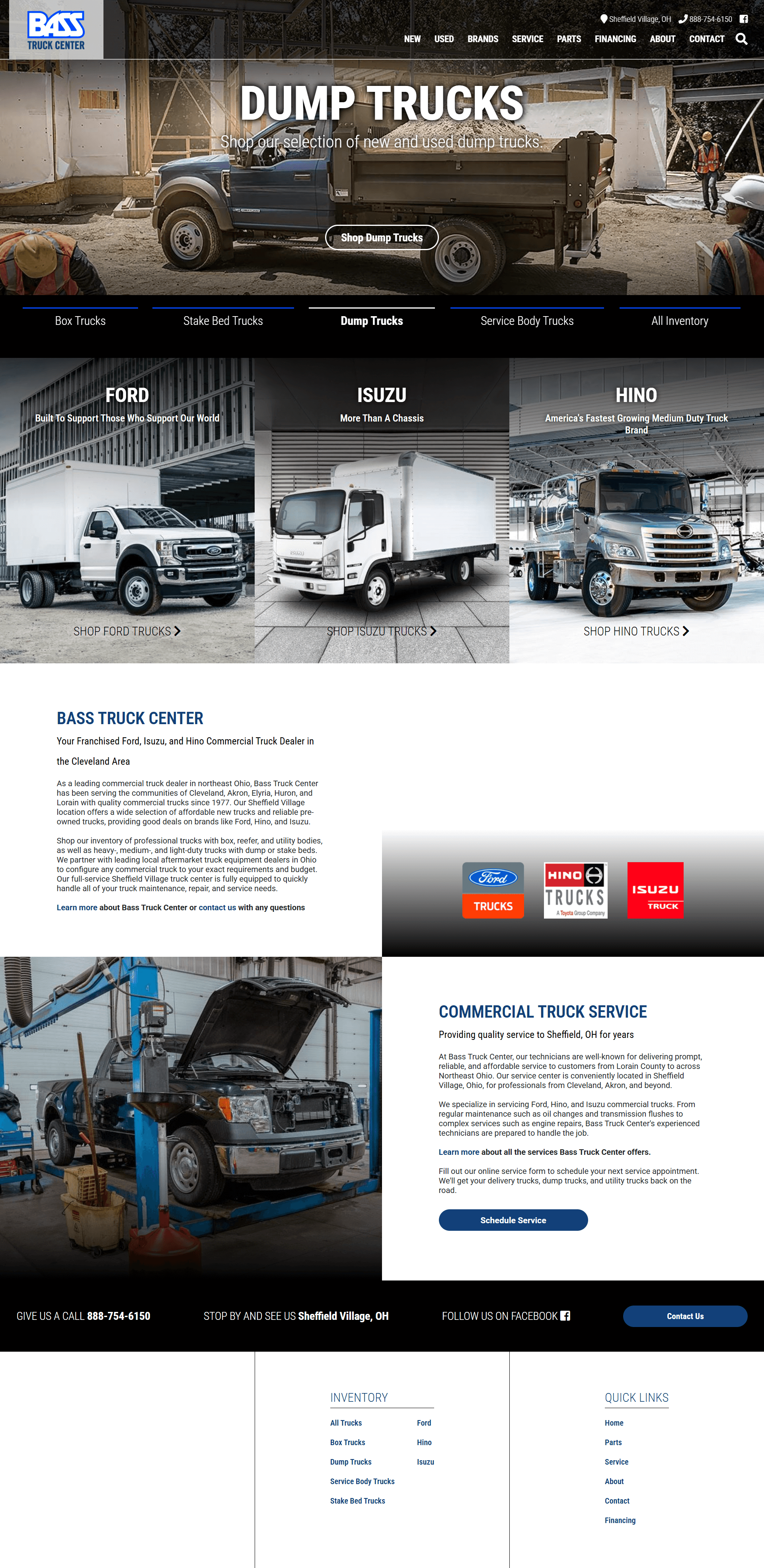
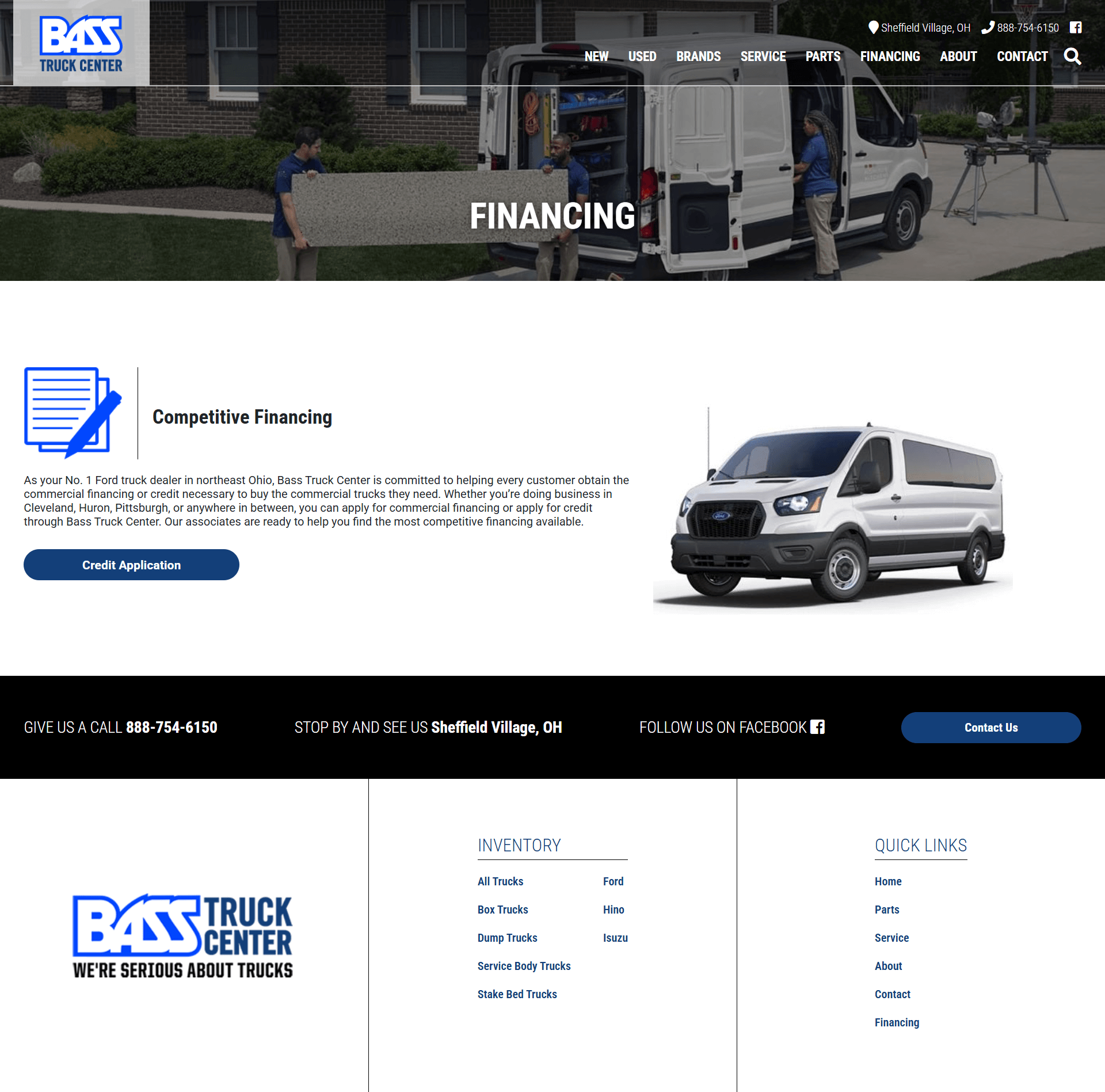
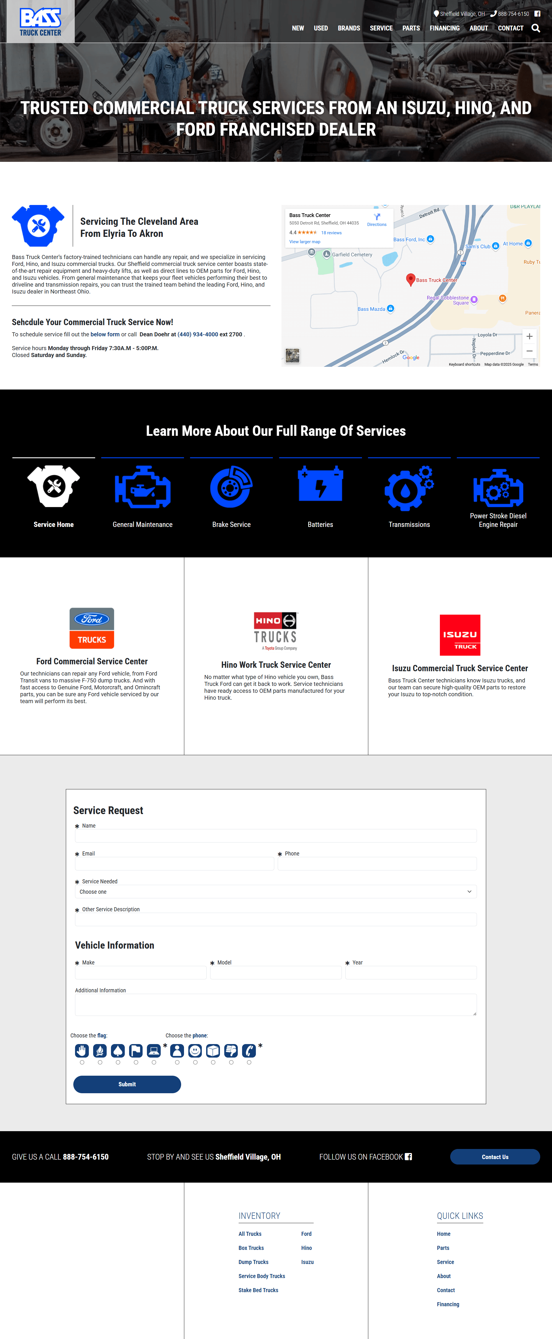
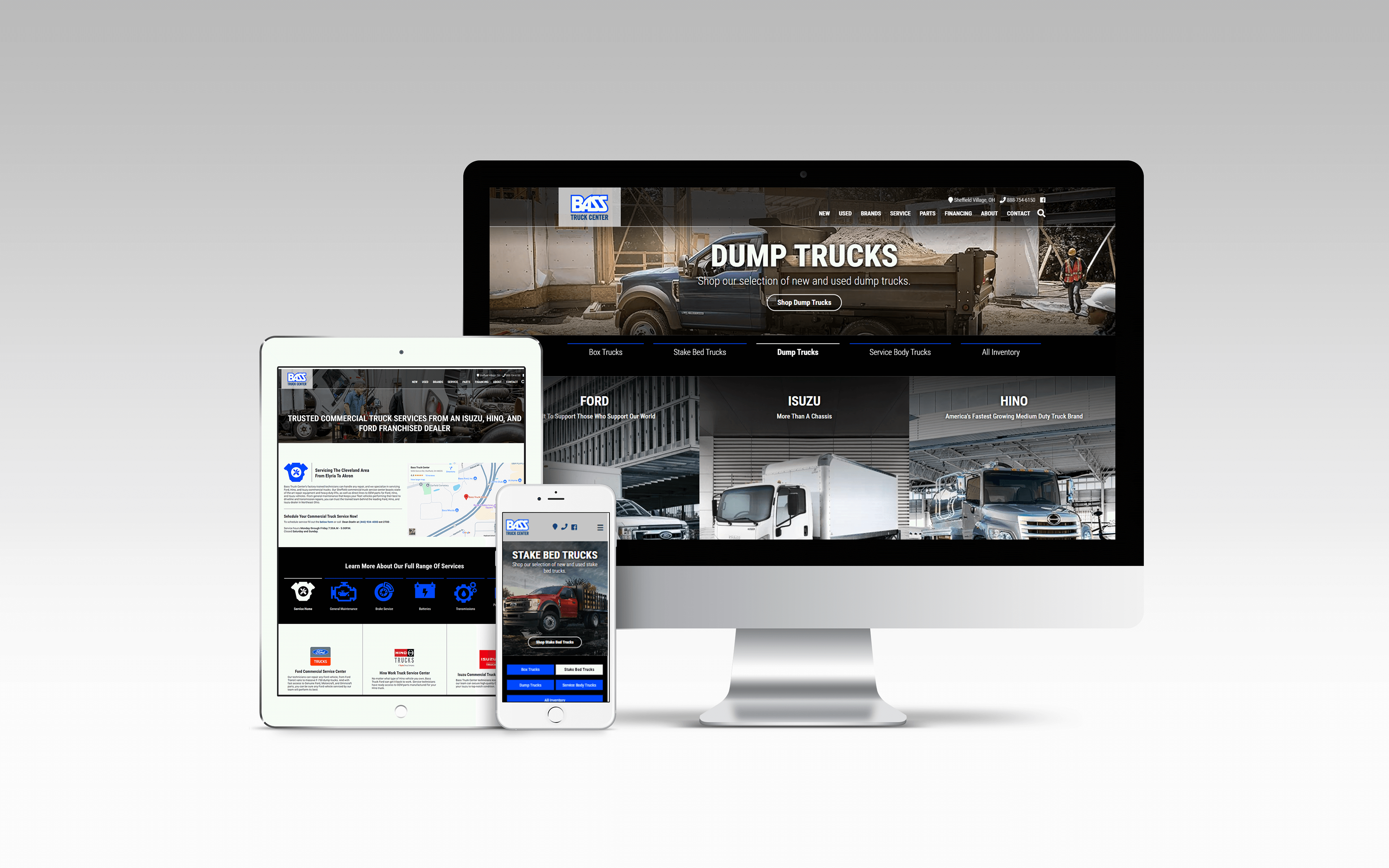
The redesigned homepage featured a cleaner, more intuitive layout that supported key user goals. Navigation was simplified, and important sections like truck inventory and service scheduling were easier to access. The content hierarchy was clearer and better aligned with what users were looking for.
The redesigned homepage featured a cleaner, more intuitive layout that supported key user goals. Navigation was simplified, and important sections like truck inventory and service scheduling were easier to access. The content hierarchy was clearer and better aligned with what users were looking for.
Calls to action that were previously vague or broken were replaced with more strategic, functional prompts that helped guide users toward the next step.

Before the Overhall
After the Overhall
Outcome
The final site was significantly faster and easier to use—particularly on mobile. Users could get to key pages quickly and without confusion, which led to lower bounce rates and stronger engagement. The business walked away with a site that not only looked better but performed better, too.
The final site was significantly faster and easier to use—particularly on mobile. Users could get to key pages quickly and without confusion, which led to lower bounce rates and stronger engagement. The business walked away with a site that not only looked better but performed better, too.
This project brought together UX thinking, SEO strategy, and cross-functional collaboration. I led the effort from start to finish—setting the direction, managing the process, and making sure the work came together in a way that met real user needs and delivered measurable value to the client.