

For my ART410 Advanced Web Design course, we were to redesign a website for a product company. As a large fan of Apple's graphic design, I decided to challenge myself to make a fresh yet clean new user interface and design for their website. The process is explained below, while the itself site can be viewed by downloading and unzipping the files from this link: https://goo.gl/bFvy2c
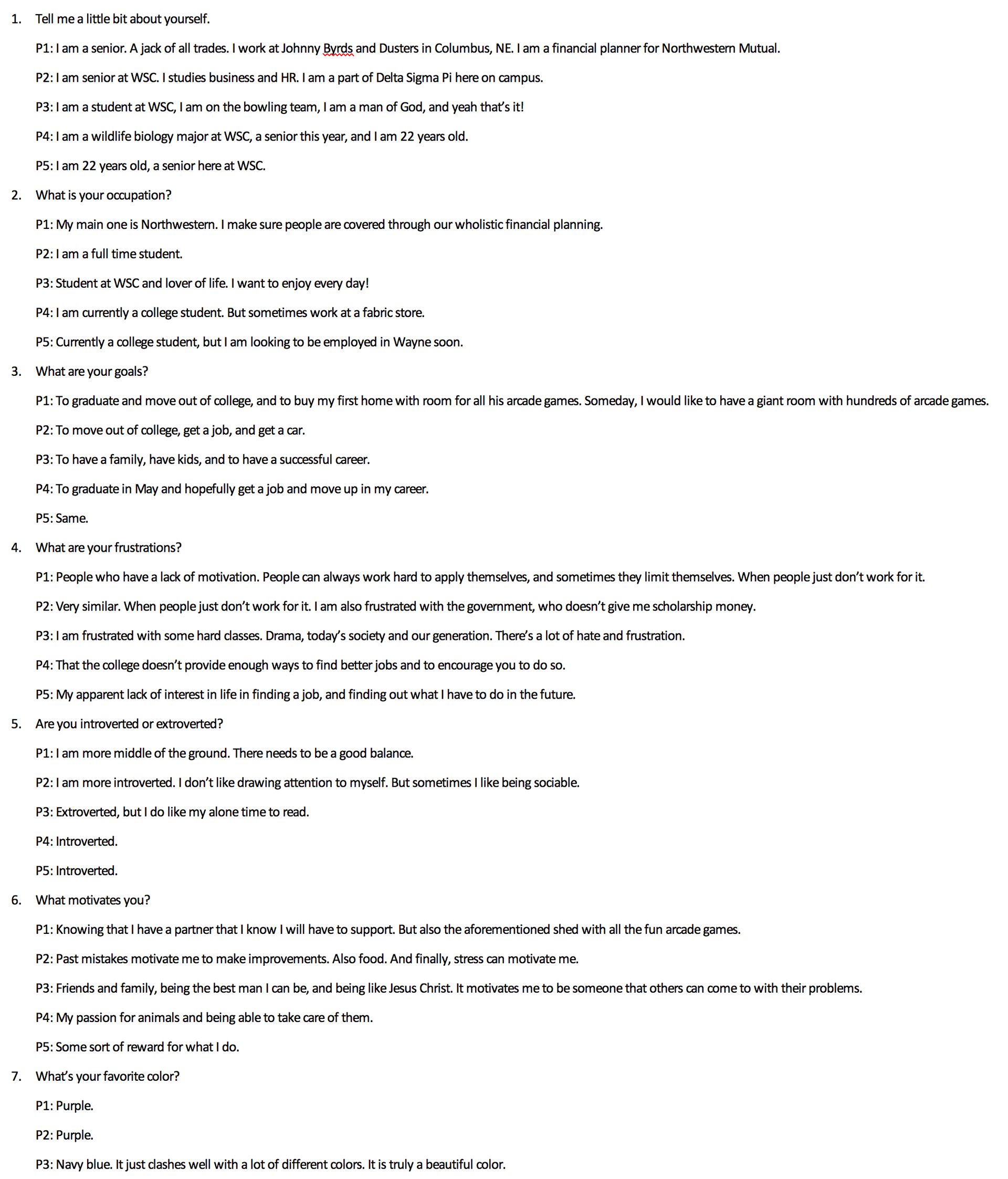
Fig. A: Part of the transcribed interview.
After selecting which website we would redesign, we were guided by our instructor through a design process. This process began with interviewing five individuals whom we thought may be potential users of our website. I interviewed five of my friends with 25 questions to get a feel of what they like to see in a well-designed technology website. A portion of the transcribed interview can be seen above in Fig. A.
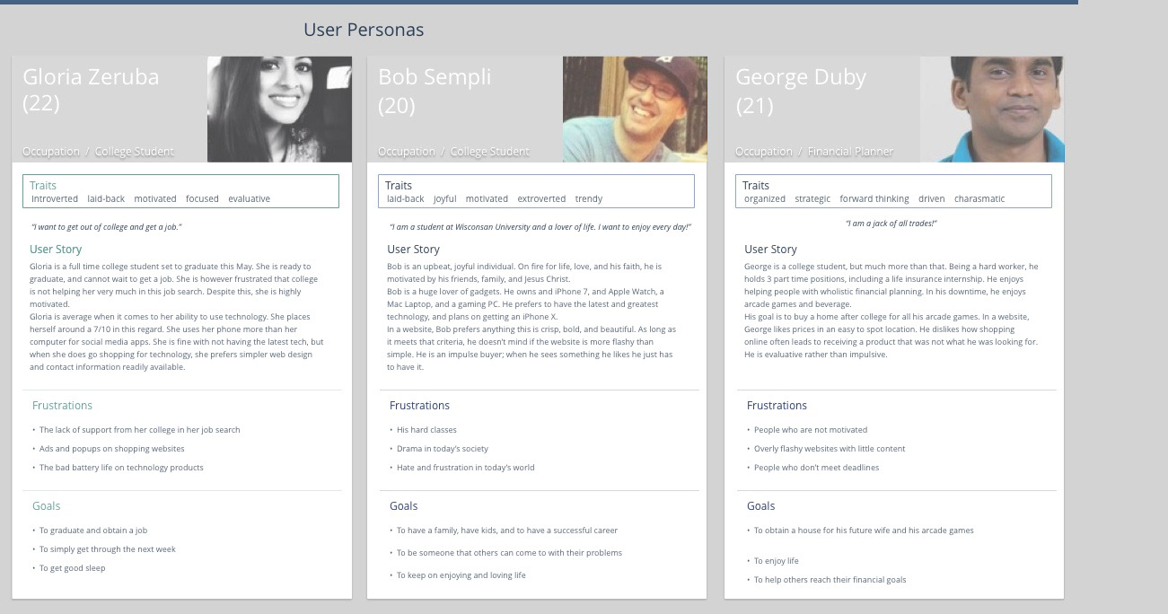
Fig. B: The personas.
It was from these interviews that we then constructed three "personas", or theoretical individuals who would use our website. This helped us really get into the mind of someone who may be visiting out site. I created Gloria Zeruba, Bob Sempli, and George Duby. The file I created for their bios can be seen in Fig. B.
Next came the drafting stage. I created some basic layouts void of any stylized fonts, colors, or images in the Sketch App. My classmates took a look at the layouts I created and chose which one they liked best. After this, I set to work making the mockups of each page. My site map was simple: it consisted of a Home page, an iPhone page, an iPad page, a Mac page, an Apple TV page, and an Apple Music page. With the exception of the Apple Music page, each of the product pages would contain a subpage (iPhone X, iPad Pro, iMac Pro, and Apple TV 4K, respectively).
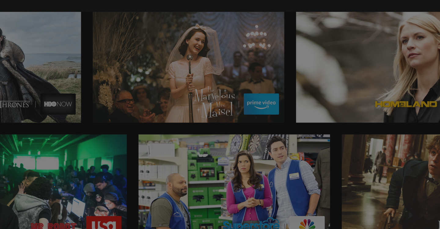
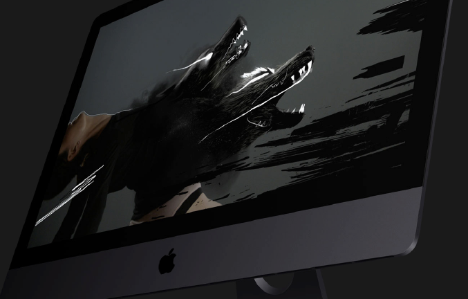
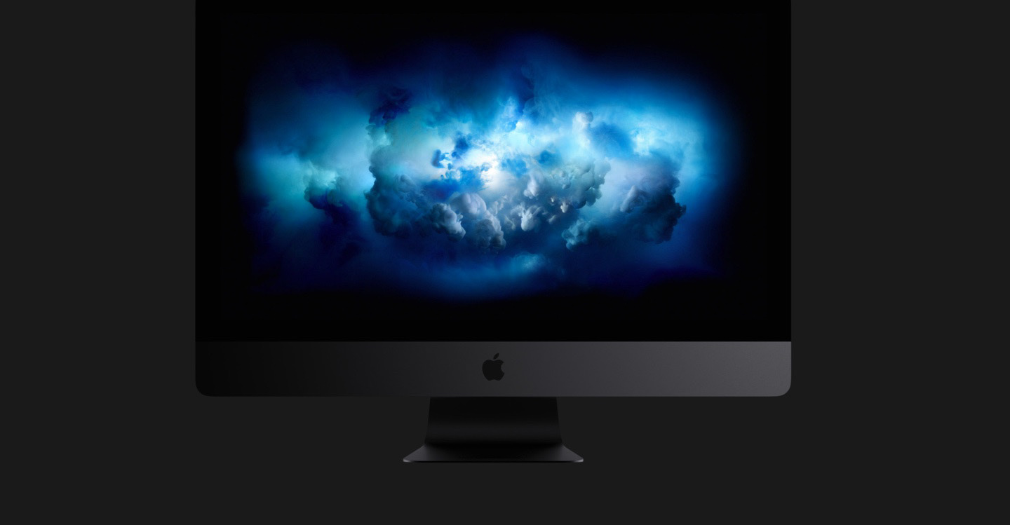
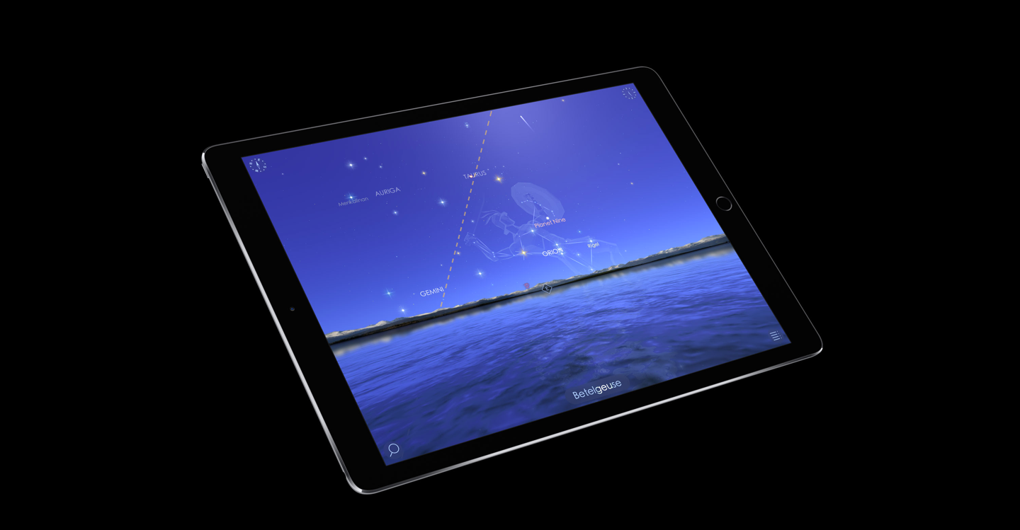
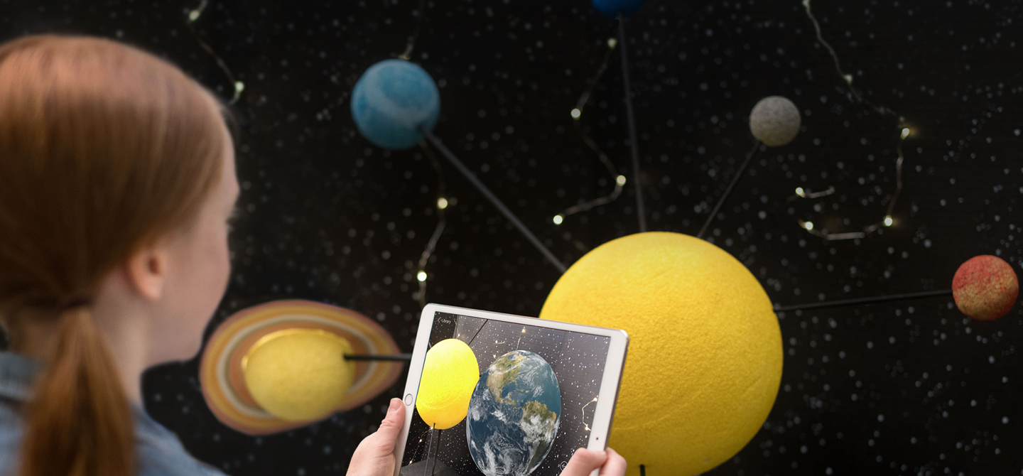
Fig. C: Some of the images that made it to the final cut.
As I wanted the majority of the pictures used to be from Apple's own website, this presented a challenge, as I had to find darker pictures on a website that is by-and-large brightly colored. Some of the images I found for the mockup that made it into the final website can be seen in fig. C.
Fig. D: Apple's retro logo which served as inspiration for the color scheme of the website.
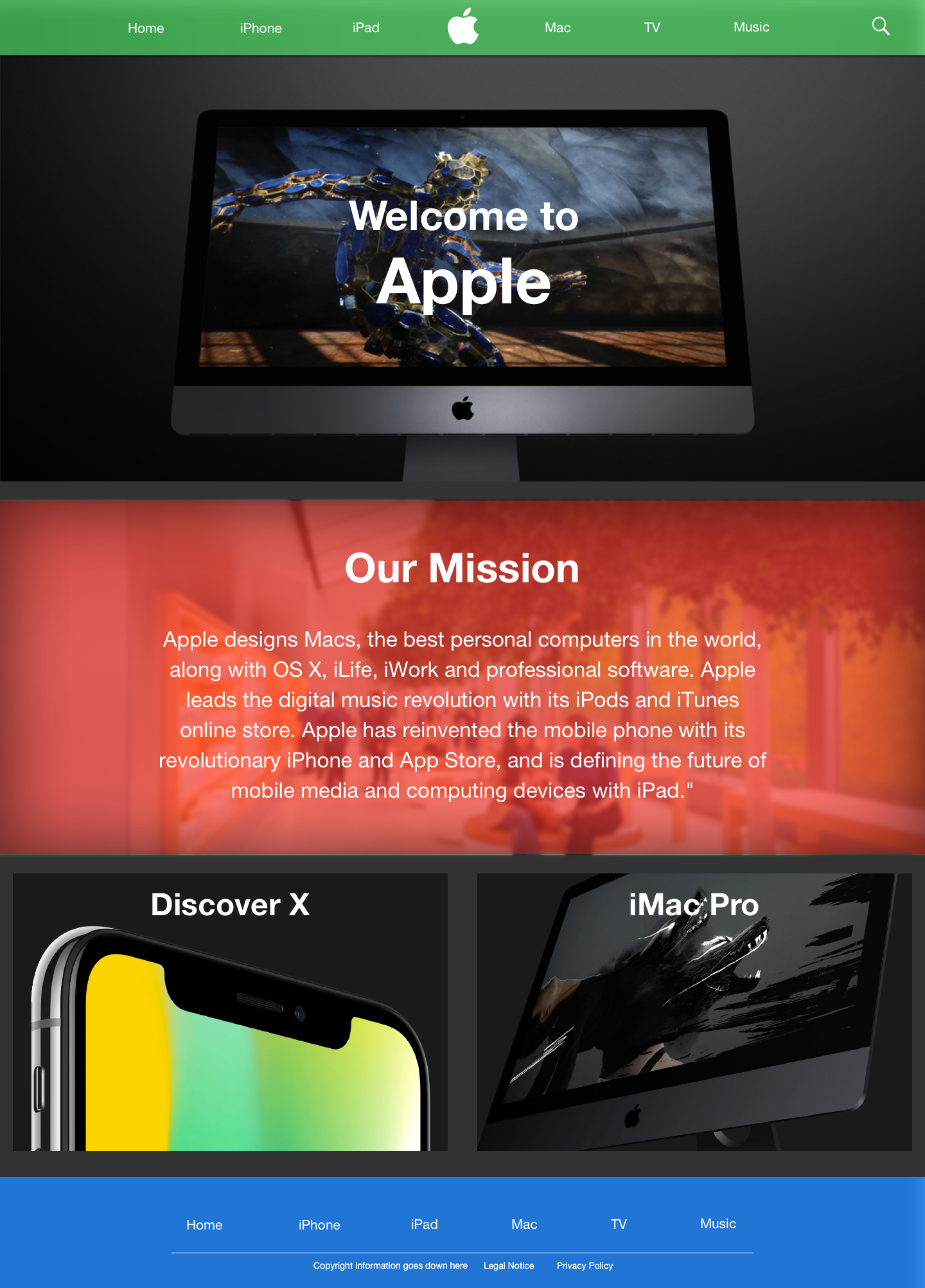
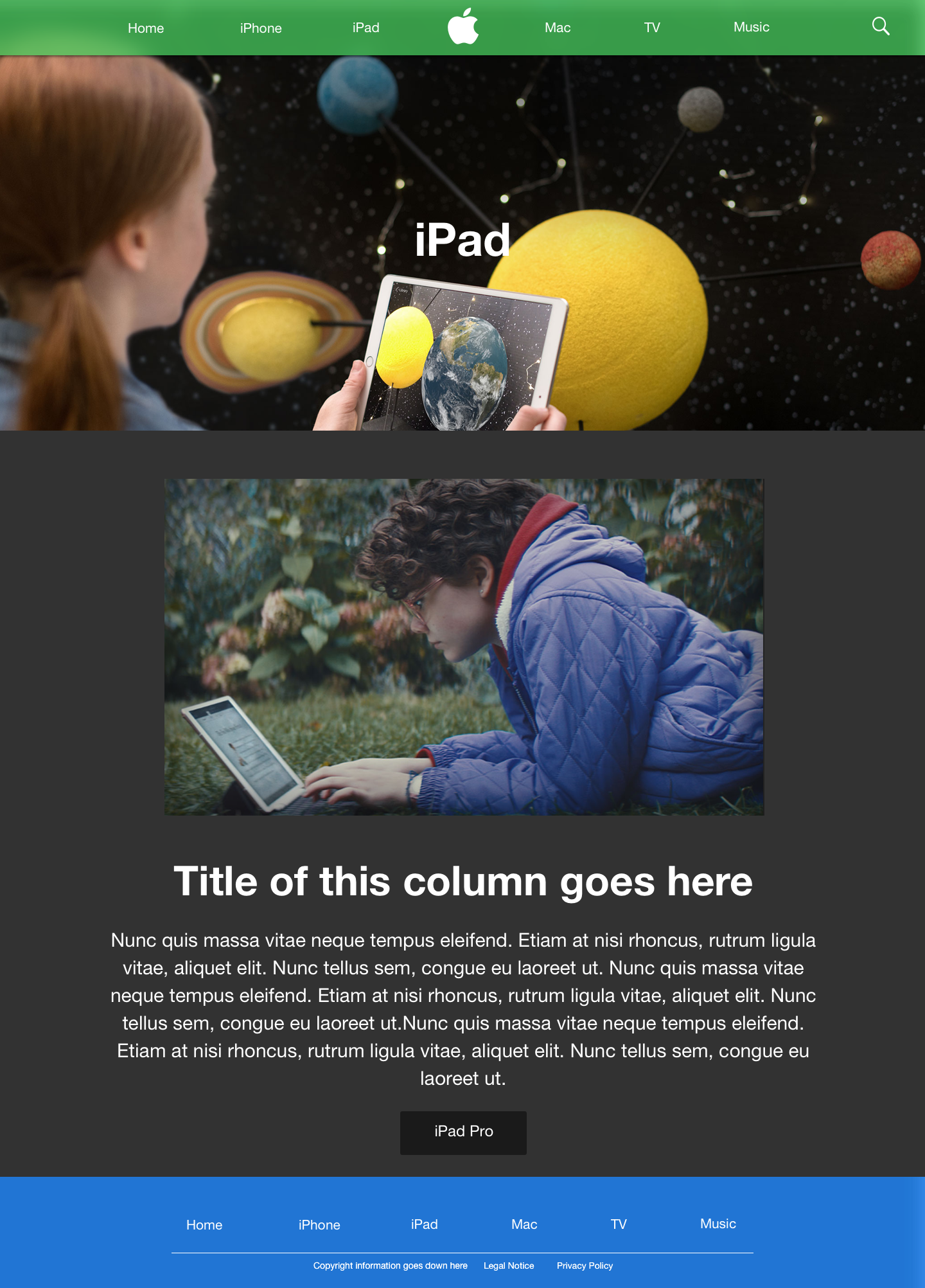
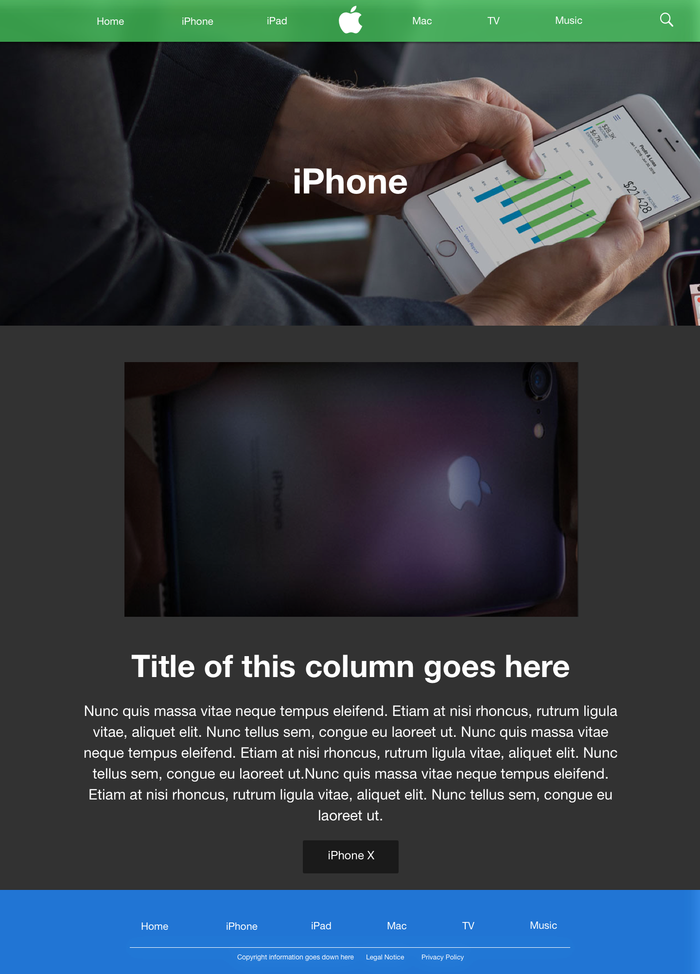

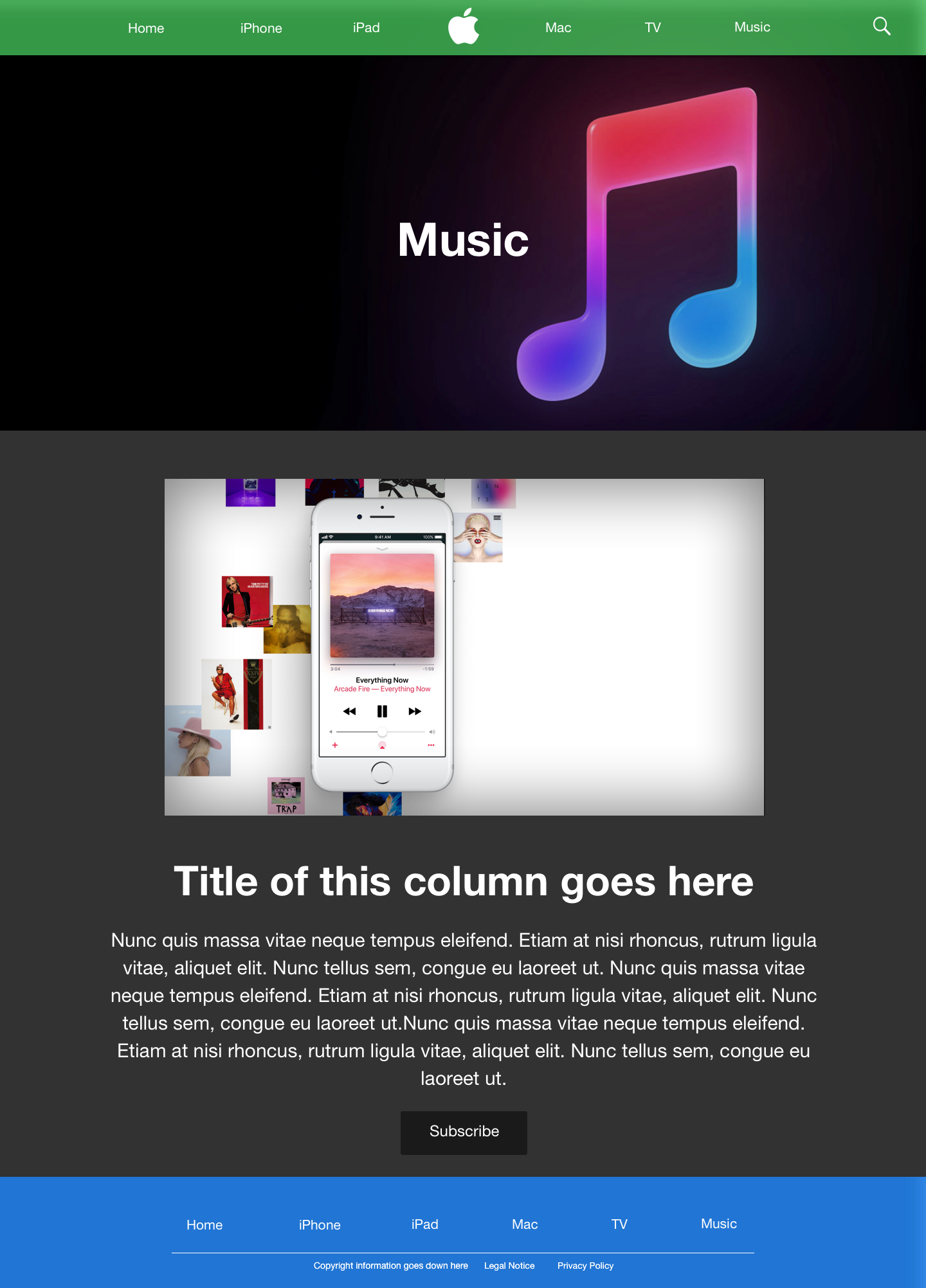
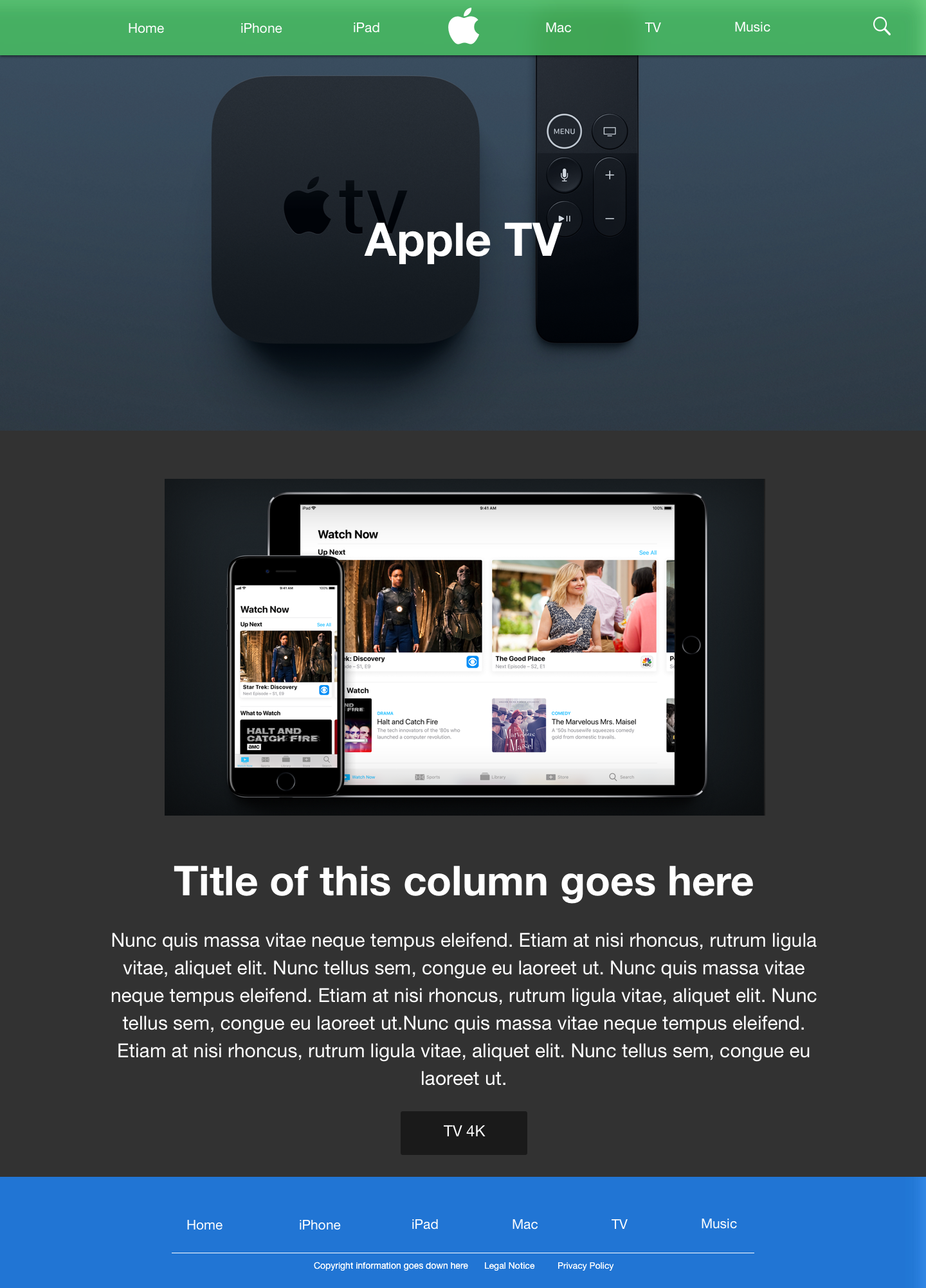
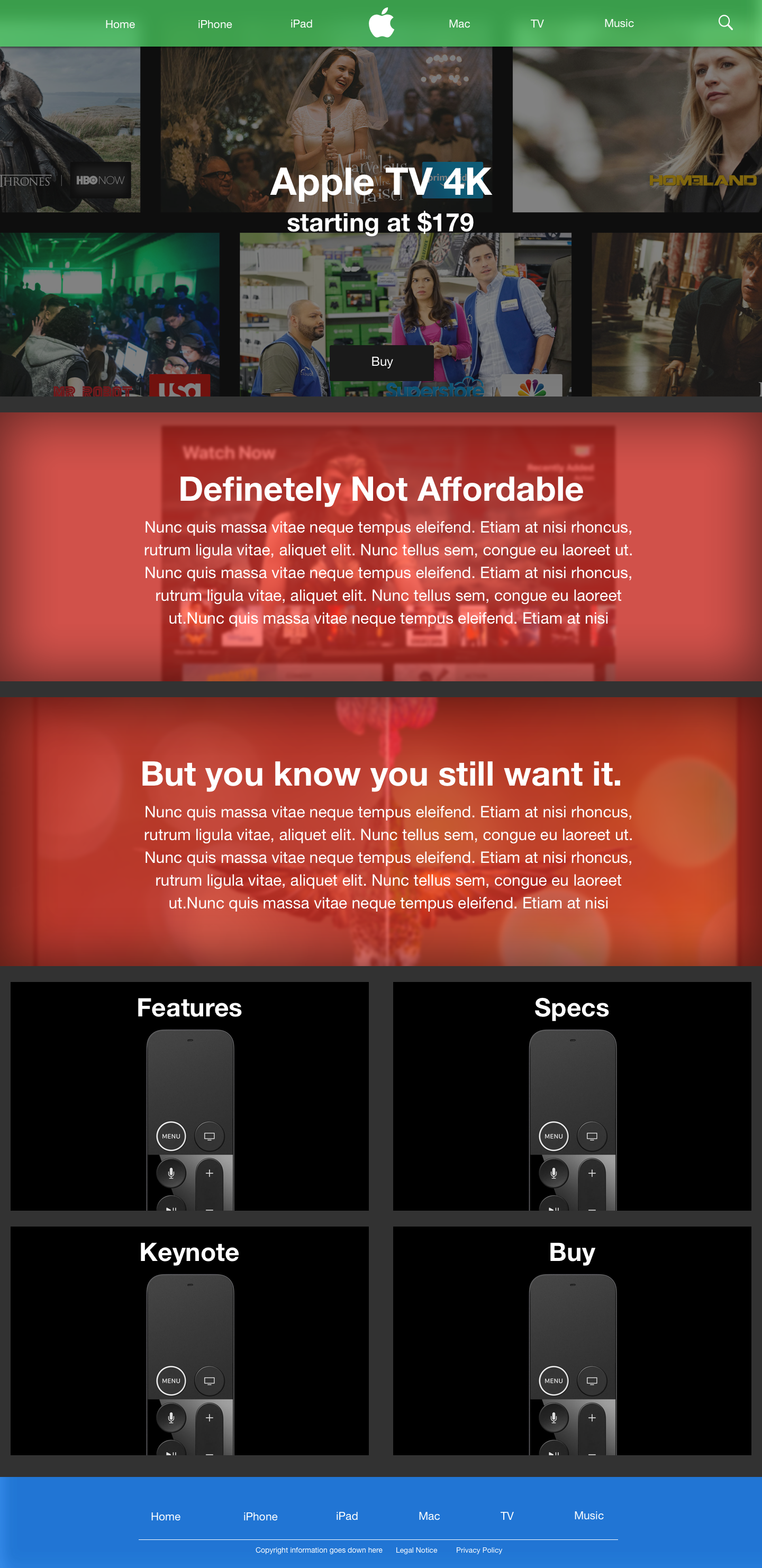

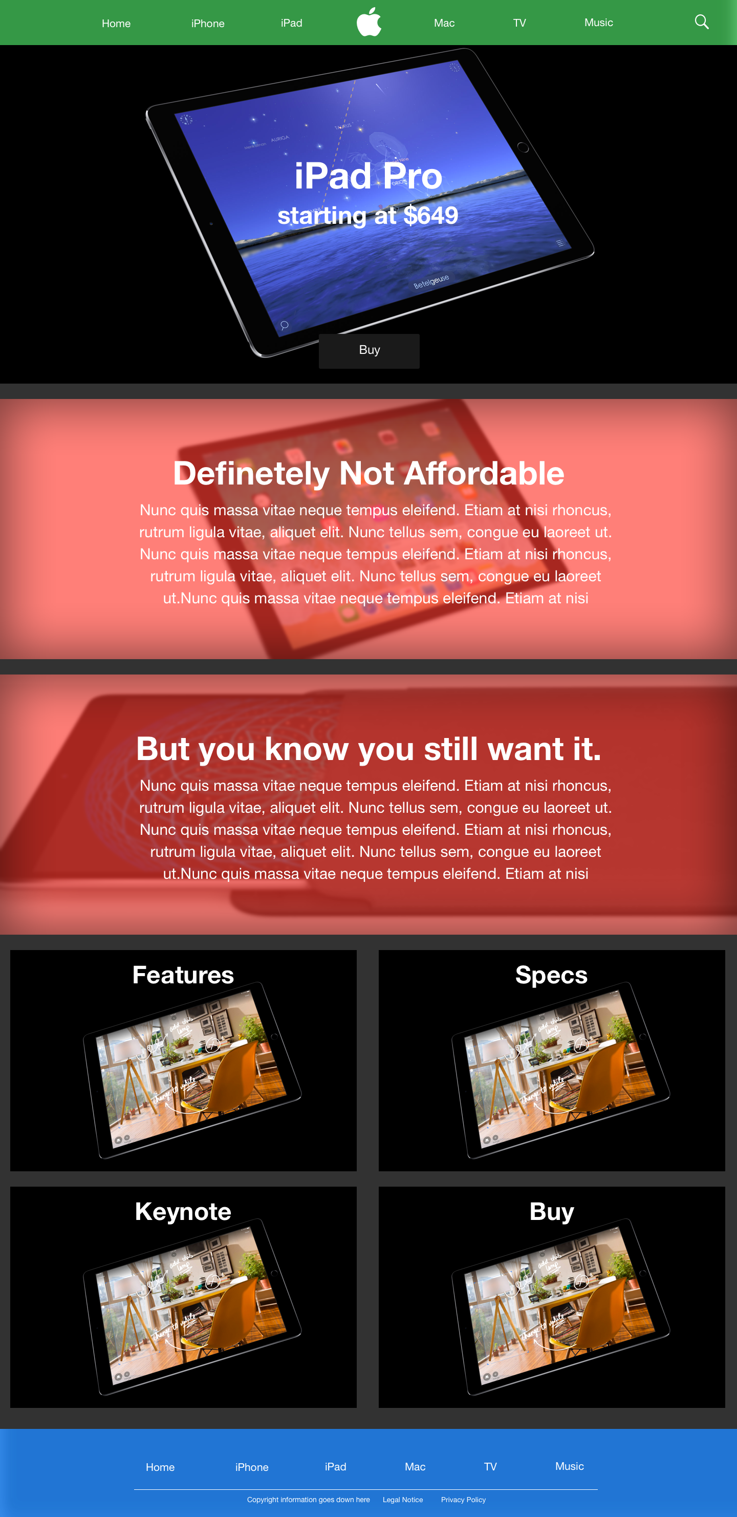
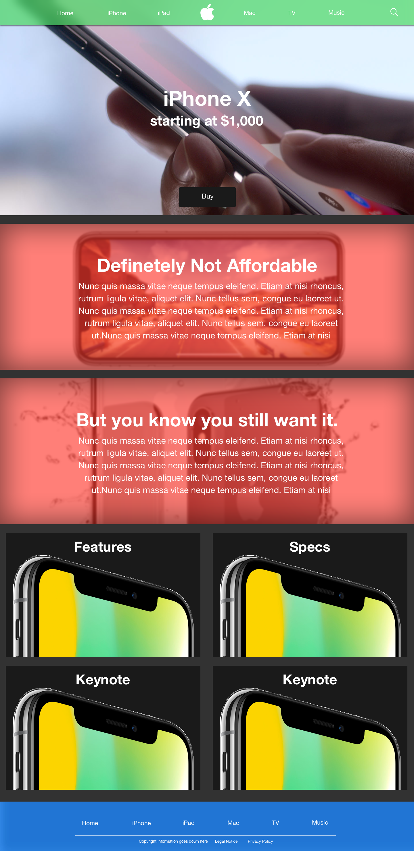
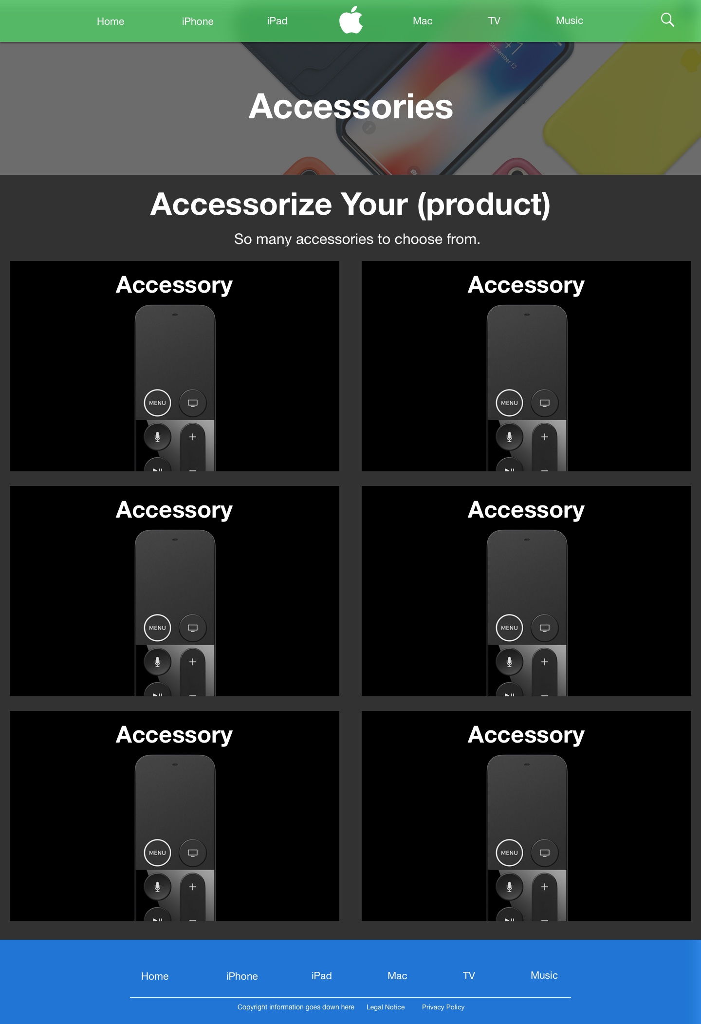
Fig. E: The final mockups.
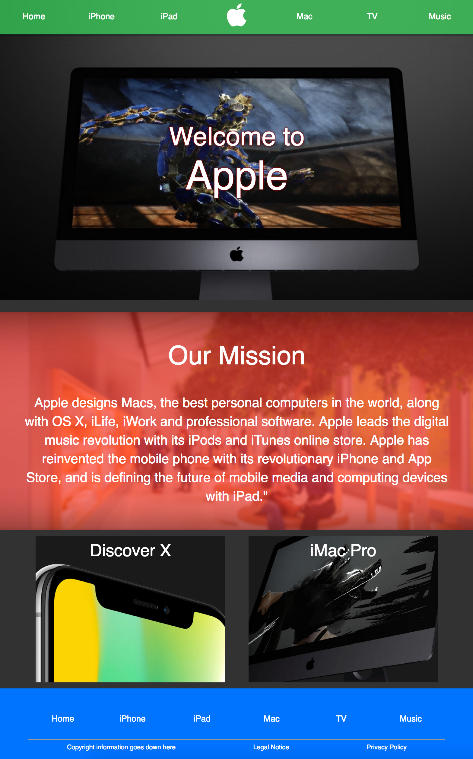
I used a dark theme for the website to make it unique compared to Apple's current site. For the nav bar and the footer, I chose to utilize green and blue, respectively. On some pages, I utilized red overlays on the body. This green, red, and blue setup was a subtle reference to Apple's old color scheme for their logo (see fig. D). The final mockups can be seen in fig. E.

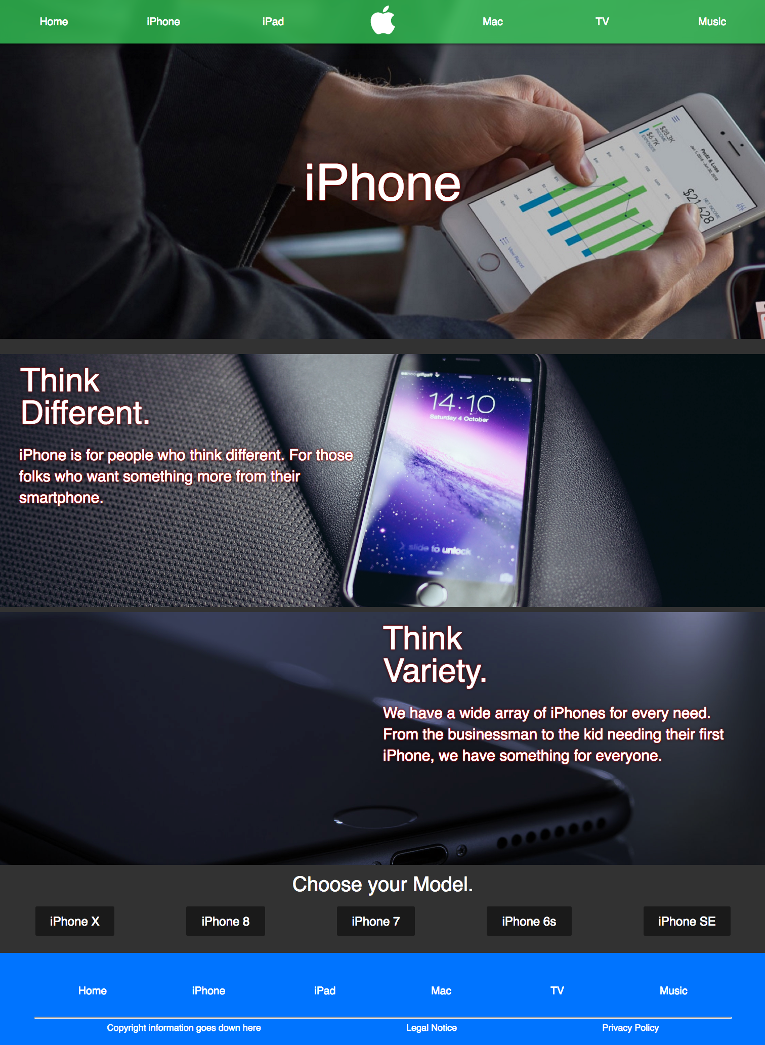
Fig. F: The iPhone page mockup (left) differs from the final coded result (right) most notably in the layout of the images and text in the body.
Next came the coding. The process was rather strait forward, as I had had many coding experience before. The biggest change I made during the coding process was done on the product pages. Rather than having a centered image with text under it on, I chose to have to images with a width of 100% with text on top of it (see fig. F). I also added more links to the bottom of each page.
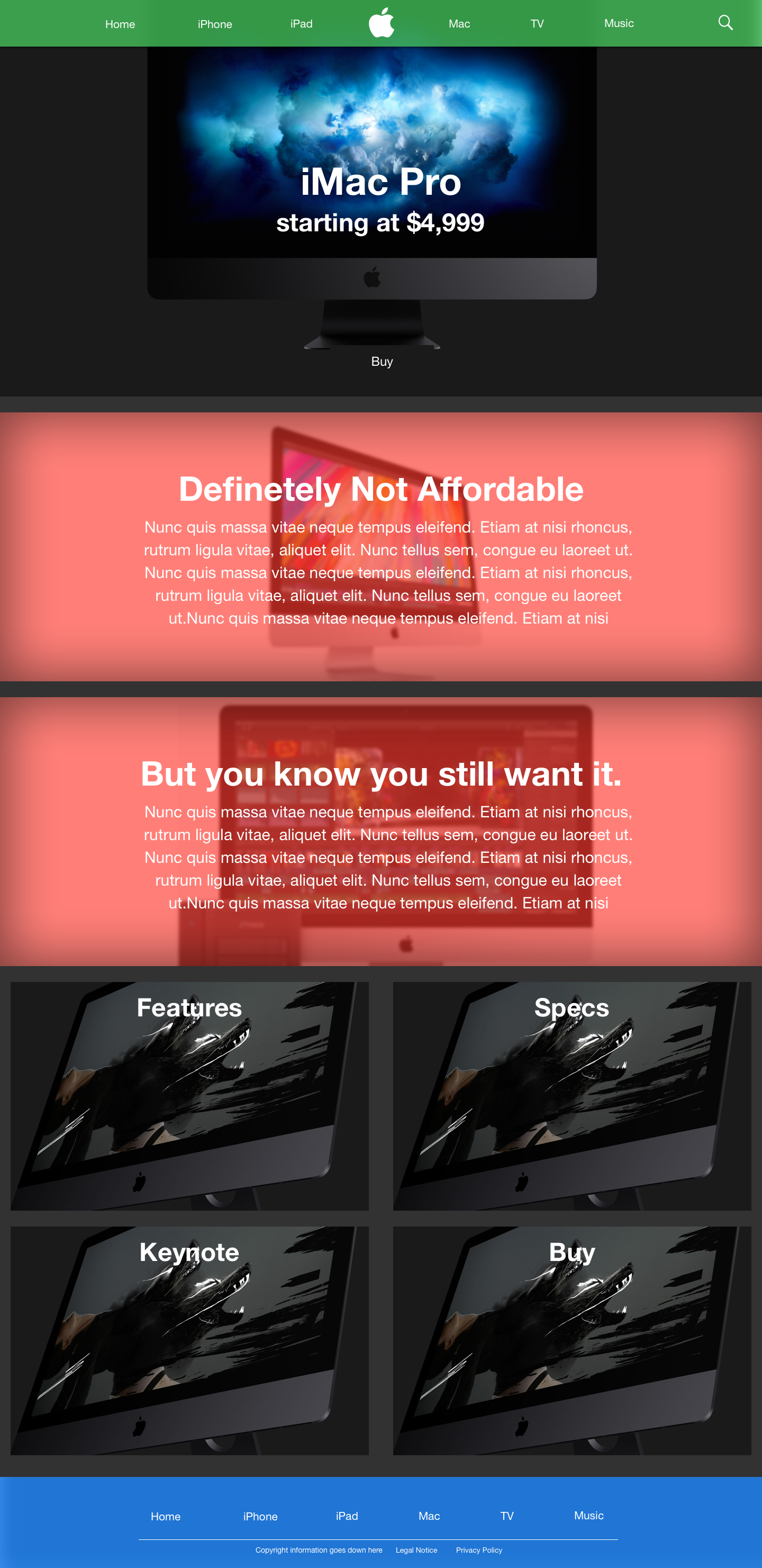
Fig: G: The iMac Pro page mockup (left) differs from the final coded result (right) most notably in the removal of the red from the page.
Another notable change was the removal of the red in most pages (it was retained only on the home page). Though I did not want to do this initially, I felt it look best this way. See fig. G.

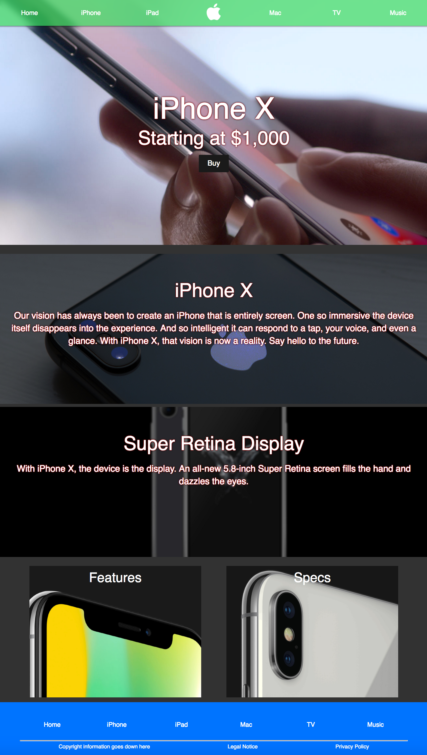
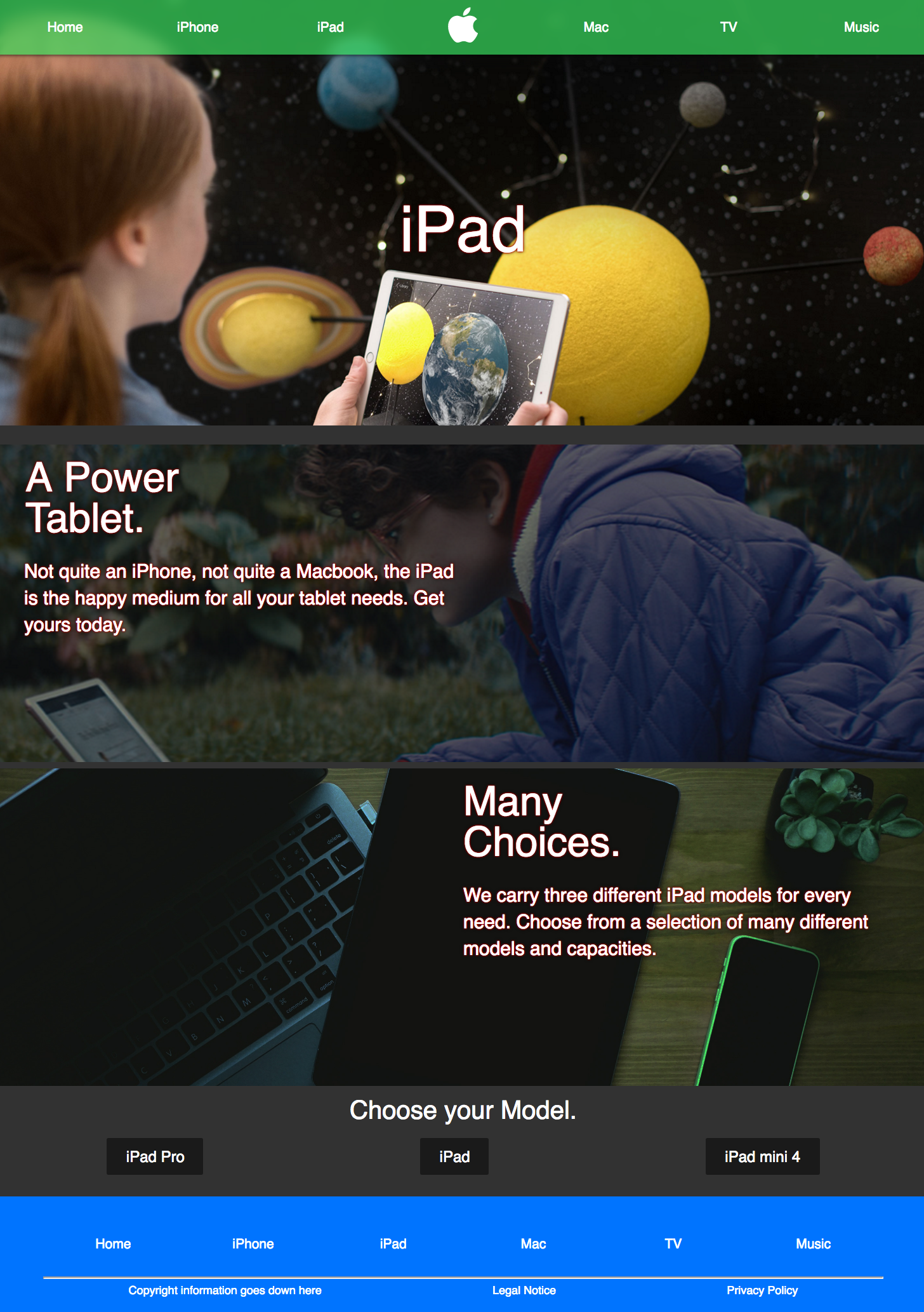
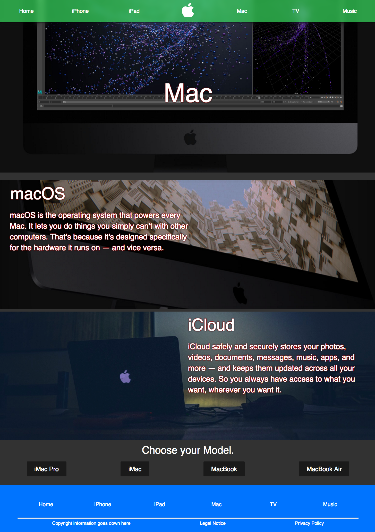
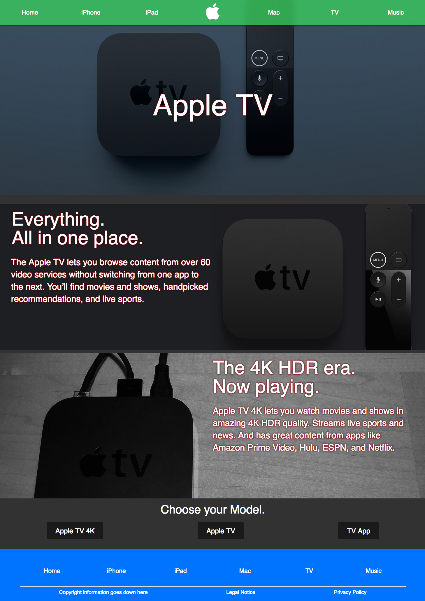

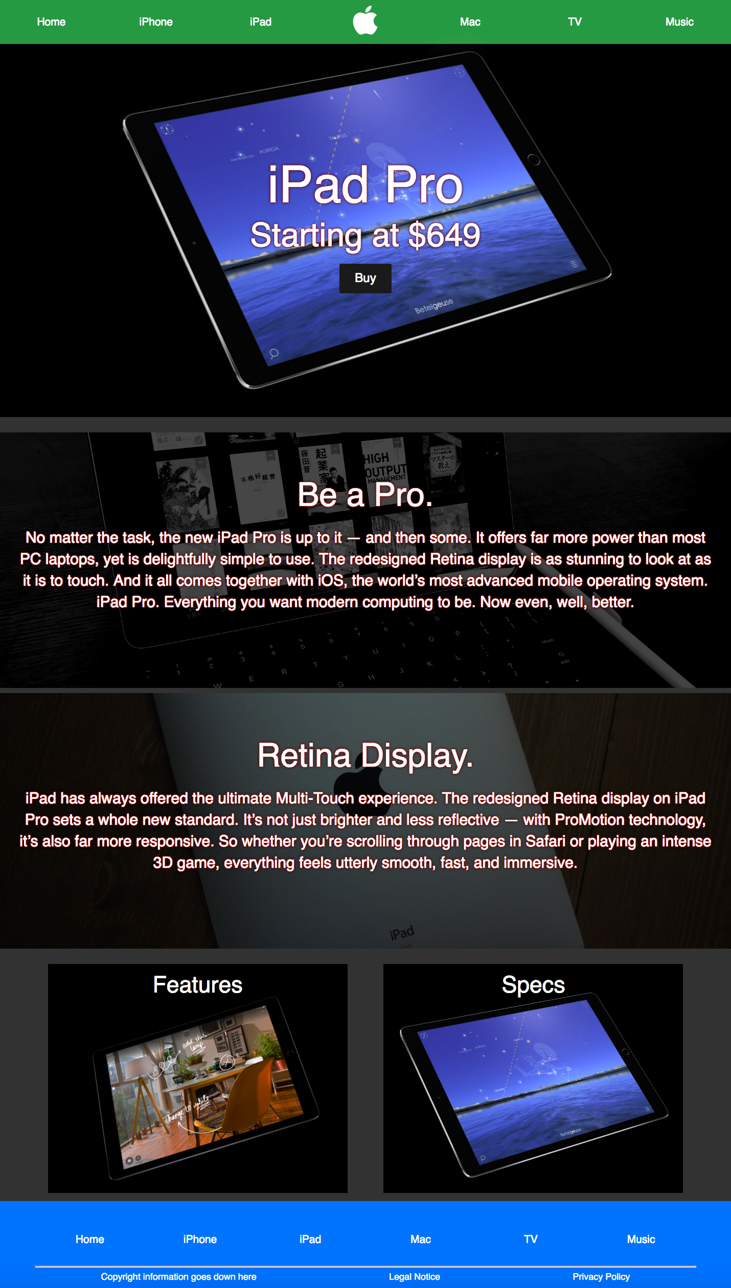
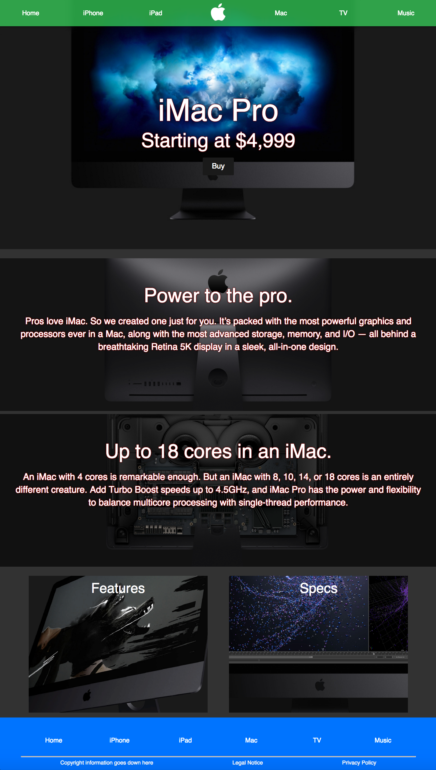
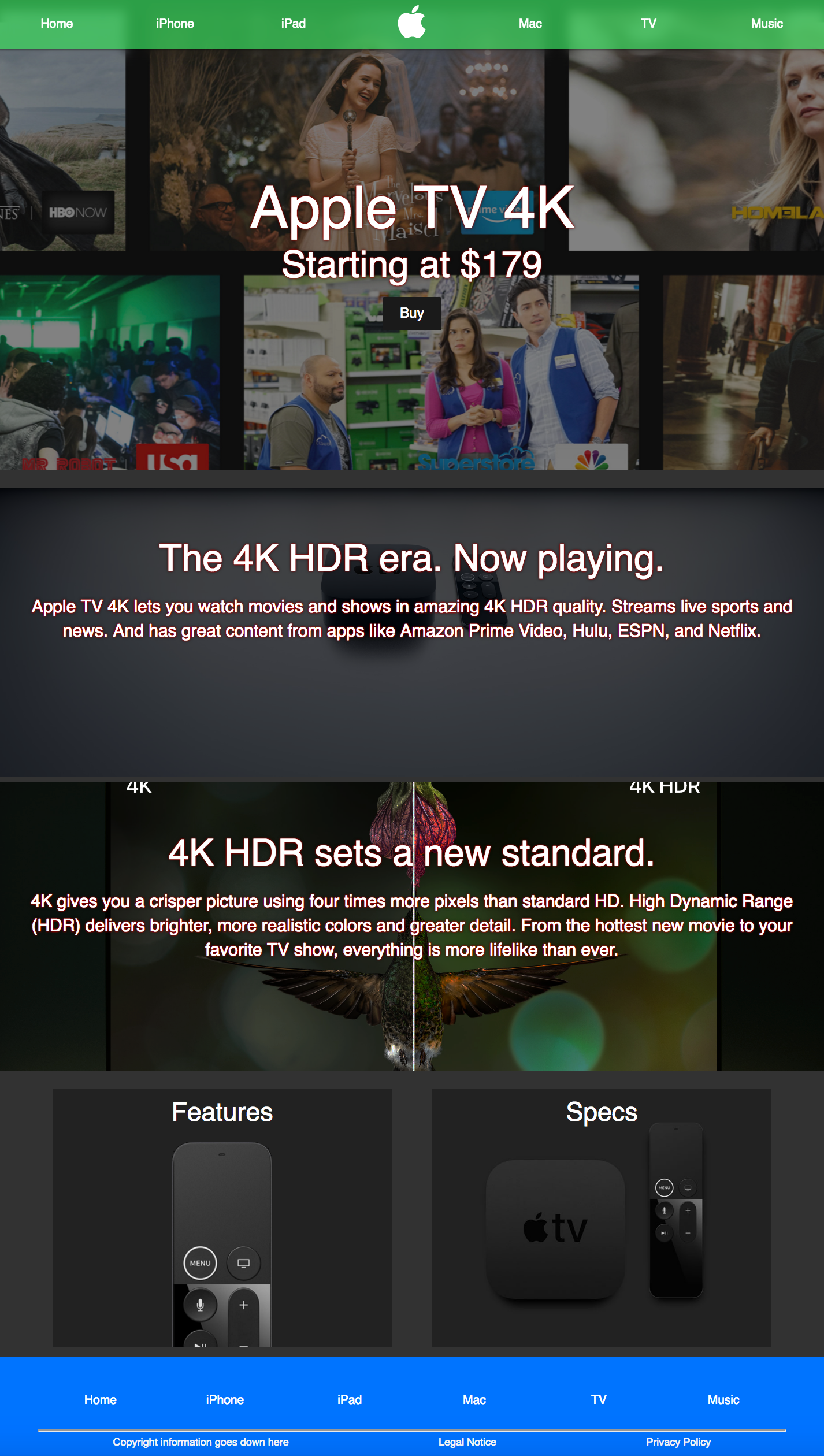
Fig. H: Every page in their final form.
After making everything responsive, the website was complete. It was coded over the course of three days, and in the end, I felt it to be one of the best websites I had ever coded. It was satisfying to see how far I had came since the first website I coded. Every page can be seen above in fig. H.